The combination of brown with other colors and shades
This color refers to spectral. You can achieve it only by mixing some paints. So it is possible to get its various variations. The combination of brown with other colors is quite often due to its neutrality. It is only important to learn how to skillfully combine it with them. This will allow you to create beautiful and harmonious interiors.
Such paints give a rather austere look in the room. But you can add ease to it if you mix the right gamut with them. Gentle, strict, rich, calm, reproduce any look in your home. Perfectly plays the role of the main gamut and is suitable for accents.
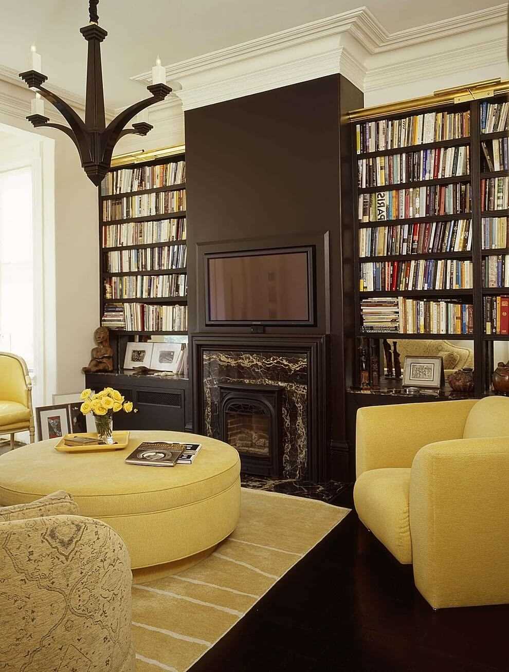
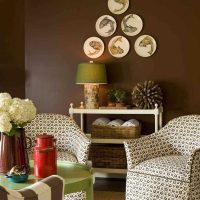
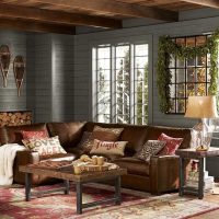
Brown can be combined with many colors.
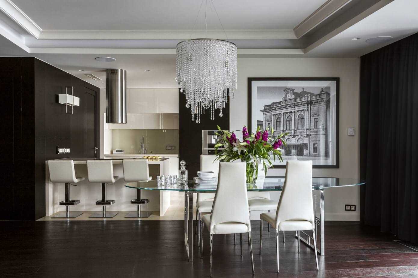
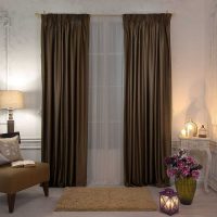
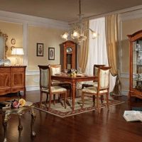
Brown is best combined with light shades.
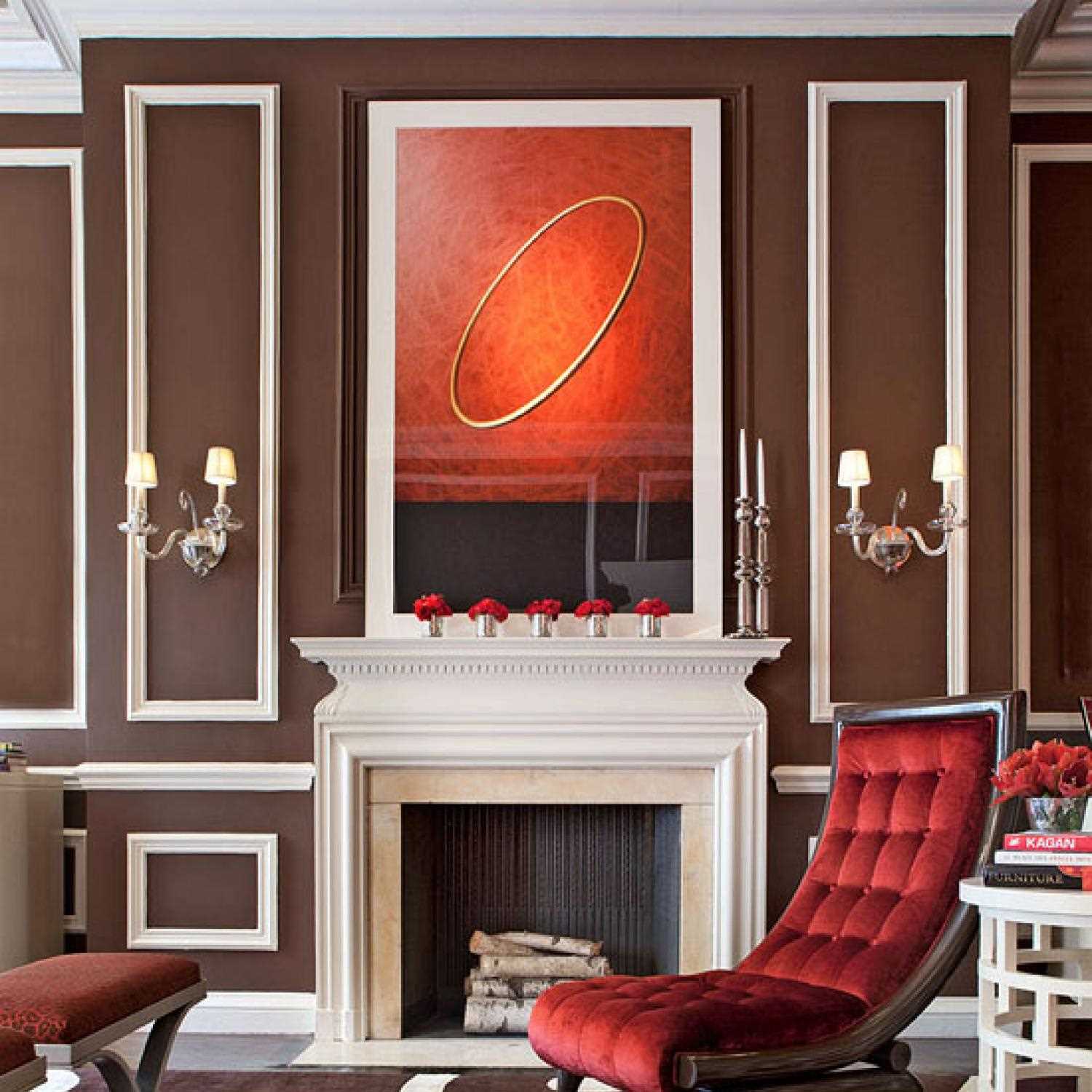
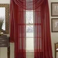
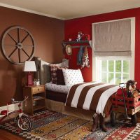
The combination of brown and red in the interior will create an atmosphere of relaxation and tranquility.
People who can be called peacekeepers like things from such a palette. Psychologists claim that this indicates a person’s desire for internal emotional comfort. He wants a trusting relationship and has spiritual growth. Many psychologists recommend using this spectrum in the room for those who live in megacities. Indeed, in a fast rhythm, people are faced with severe stress, there is no opportunity to often contact nature. And coffee or chocolate paints will help to fix the situation, add coziness and a sense of reliability. If the room is not distinguished by an abundance of light, is not on the side of the sun, choose warm light colors for the decor. For other rooms, dark ones will do. With proper lighting and the sunny side, they will not eat up the space.
The first option creates a romantic interior that is perfect for representatives of creative professions. The second case is conservative. The combination of brown with other shades allows you to use it in any style, space of different sizes. People with different tastes and preferences will be able to find their perfect combination for the room.
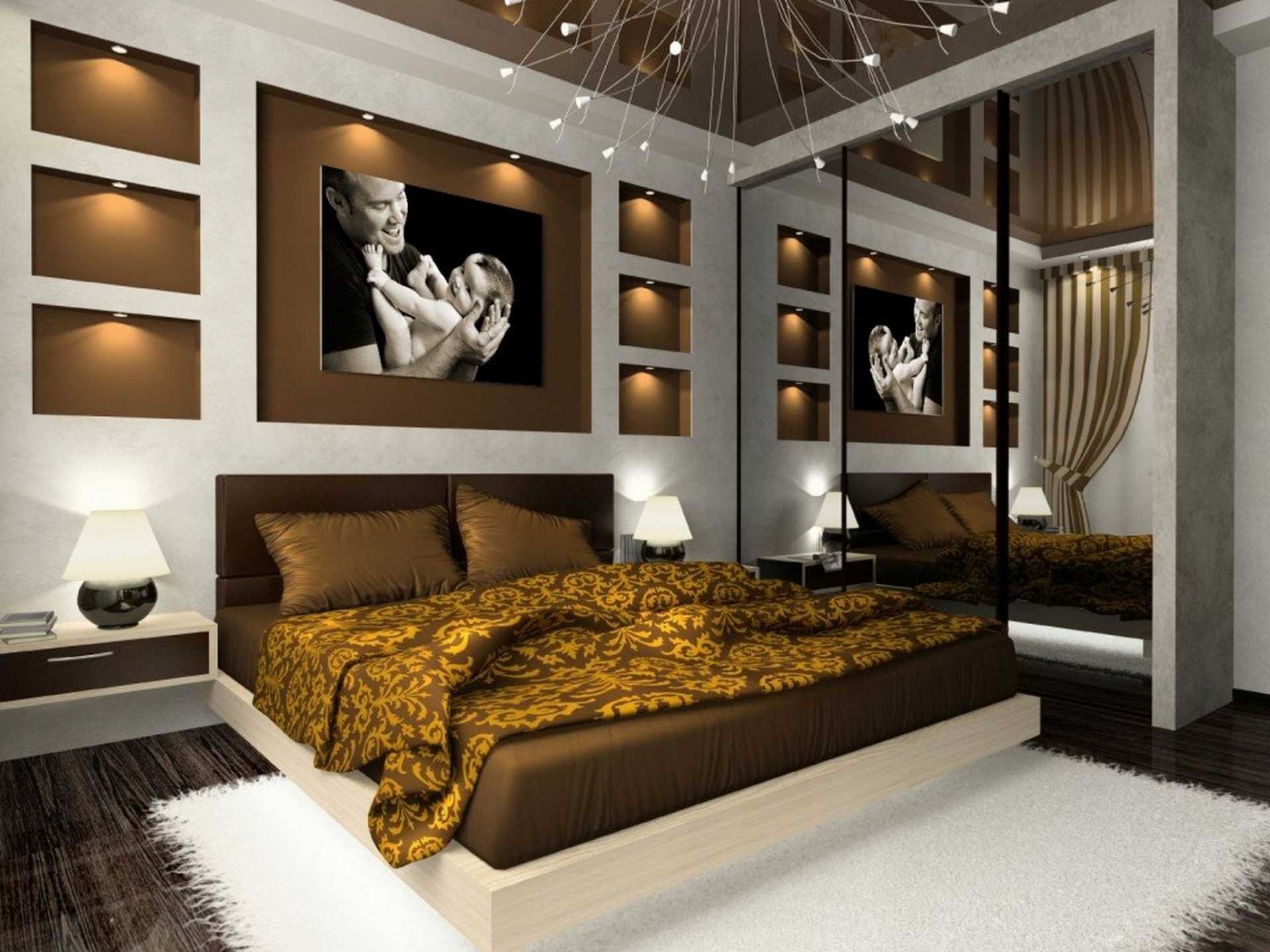
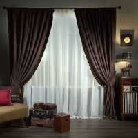
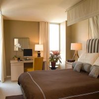
The brown bed will merge perfectly with the bedroom interior
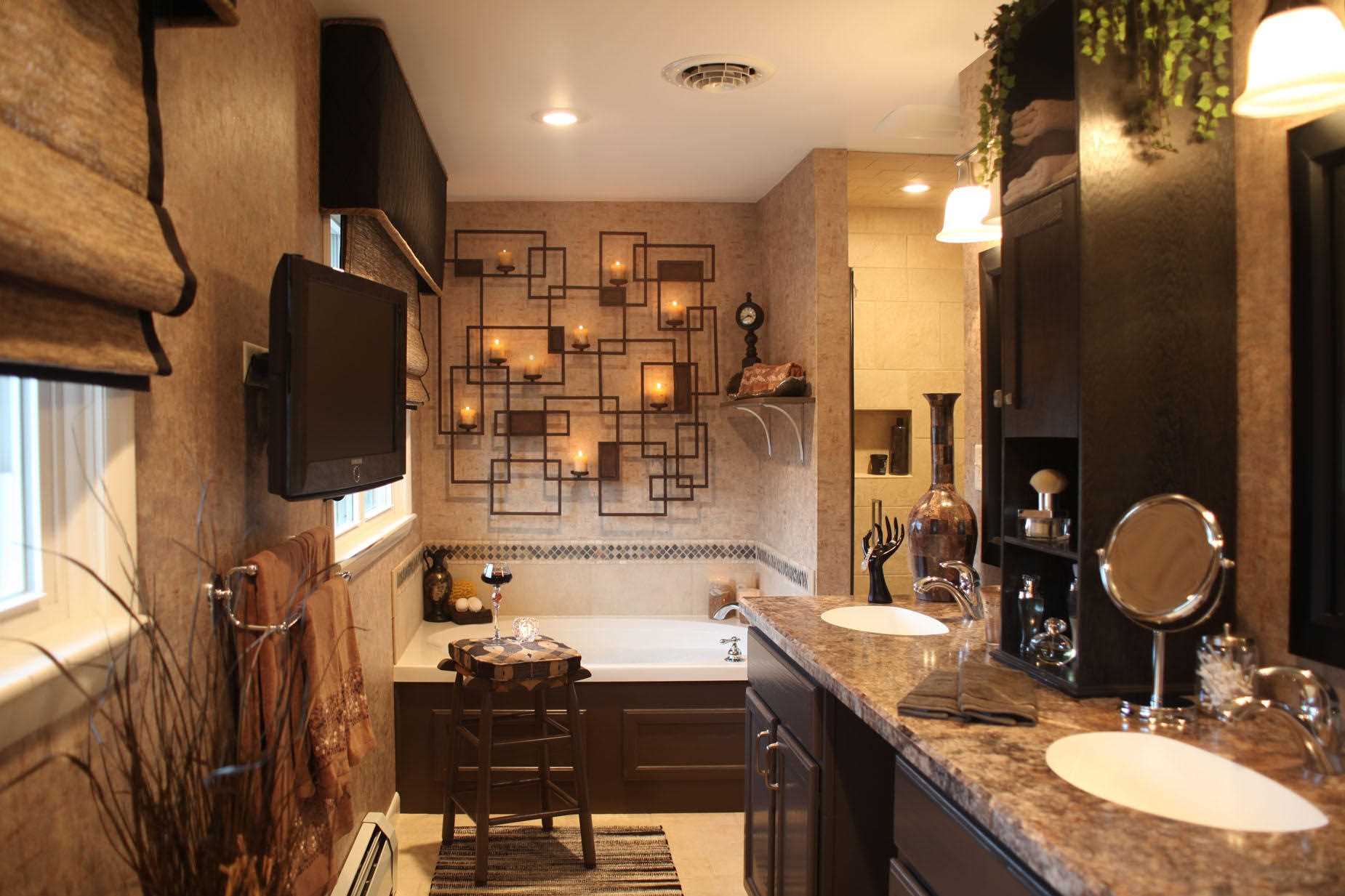
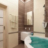
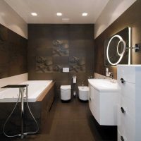
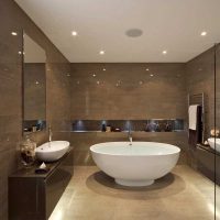
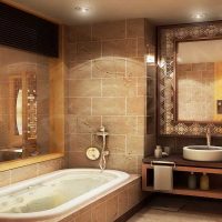
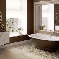
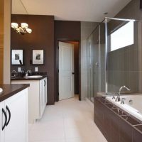
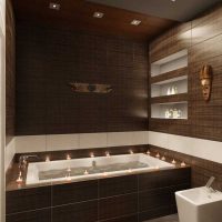
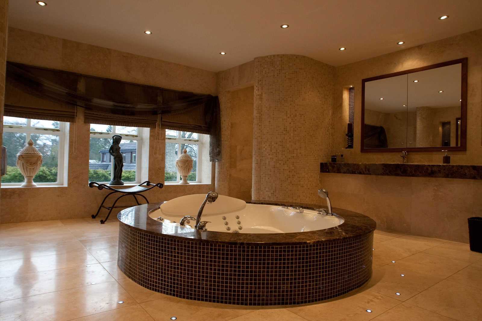
The design of the bathroom is made in brown in a modern style.
Content
- 1 Shades of brown
- 2 Combinations of brown with achromatic colors
- 3 Brown and black
- 4 Brown and gray
- 5 Brown color with chromatic tones
- 6 The combination of a brown "umber" with black and other colors
- 7 Brown color "bolus" and its combinations
- 8 His adherence to others always looks interesting and expressive.
- 9 Brown taupe combinations
- 10 Video: Beautiful color combinations. Brown colors
- 11 50 photos of examples of combining brown with other shades:
Shades of brown
There is a conditional division of them into dark and light. In addition, each of them can be cold or warm. There are several main ones:
-
Dark. Associated with dark chocolate and coffee. It belongs to the classic range. Able to emphasize high status and nobility;
-
Reddish. It looks luxurious and reminds of mahogany by associations. Personalizes quality and respectability;
-
With yellowness. It strives for an orange gamut, but differs in less pronounced brightness and its depth. It is used mainly for accents, rather than in the basic version. With such a gamut, you can create an optimistic and cheerful design;
-
Grayish. It is called taup. Discreet and may well become the basis in the design of the room.But be sure to complement it with expressive, rich accents;
-
Light coloured. It envelops and fills with a sense of calm and comfort. Suitable for many colors, which creates a huge scope to create and implement various ideas. Fills the room with light, visually increases the space. Can be used as a base and accents.
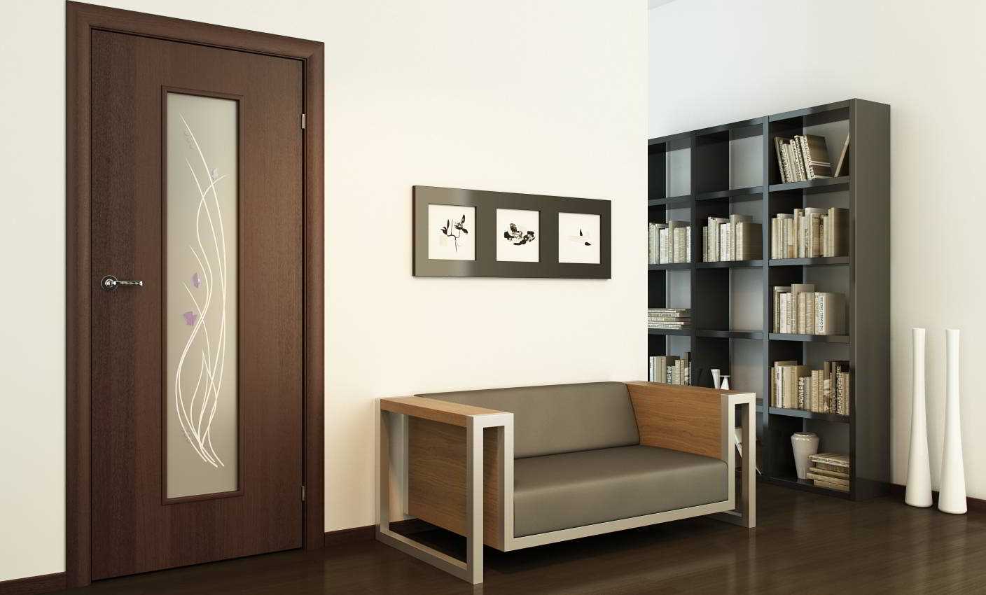
Brown color blends very well with light shades.
For competent selection of colors, you can use the color wheel
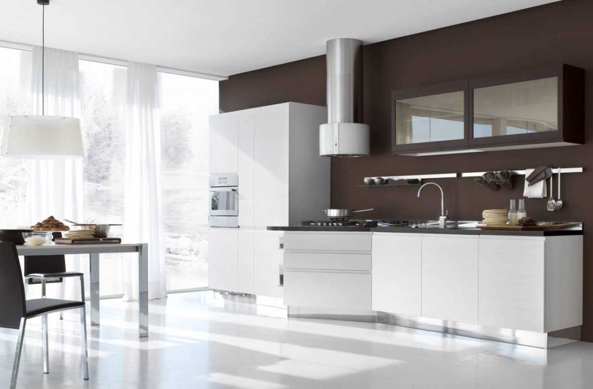
In modern design it is best to combine brown and white
Table of popular color combinations
|
Brown + white
|
White is considered universal. Therefore, the combination of brown with it looks great. White is able to add freshness and light, slightly diluting gloomy notes. It is recommended to make it dominant, basic. The second let it act as an additional, in the form of details. If such a decor seems quite banal and boring, you can dilute the simplicity with a third tone, acting as a link. Add some catchy accents, but don't go overboard. This gamut should remain dominant. |
|
Brown + beige |
Beige is much softer than white. It also comes in a palette of light colors. Therefore, related to each other, they are perfectly connected in one space. They will give a feeling of relaxation, comfort, envelop in warmth. The option is completely independent, everything is mutually complemented. Therefore, you should not add a third in the form of an accent. Play with textures to embody a unique style.
|
|
Brown + red |
Red is perceived as the embodiment of brightness and sharpness. It is associated with strength and energy. The second of this tandem, in turn, is calm. This allows you to get a harmonious final design. Complete with white or blue details. This will make the design more holistic, complete and attractive. |
|
Brown + orange |
This tandem looks more harmonious than the previous one. Orange is the personification of brightness, but it does not have a large, overwhelming force. He gives a good mood, charging optimism. Combine it with darker colors to create a spectacular overall look. Chocolate is perfect for saturated orange. The result is a contrasting and spectacular design. It will be better if you introduce white as an additional into the overall composition. He will not extinguish the main palette, on the contrary, will emphasize their depth more. A few details are enough. |
|
Brown + yellow
|
The mix looks very warm and sunny. On the color wheel, they are nearby. Therefore, their use in one room is permissible and looks attractive. Use soft yellow, but lighter, slightly blurry. Then it will be possible to reproduce a more calm and soft version. The main, key is to make it yellow. Accent details can be selected in an additional range. |
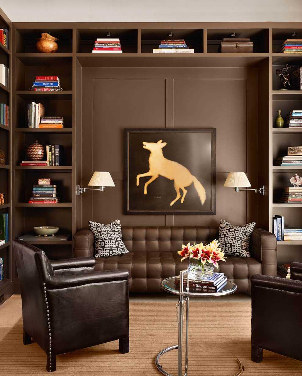
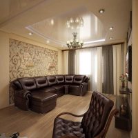
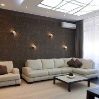
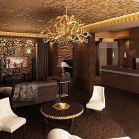
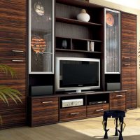
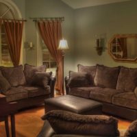
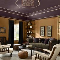
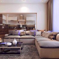
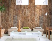
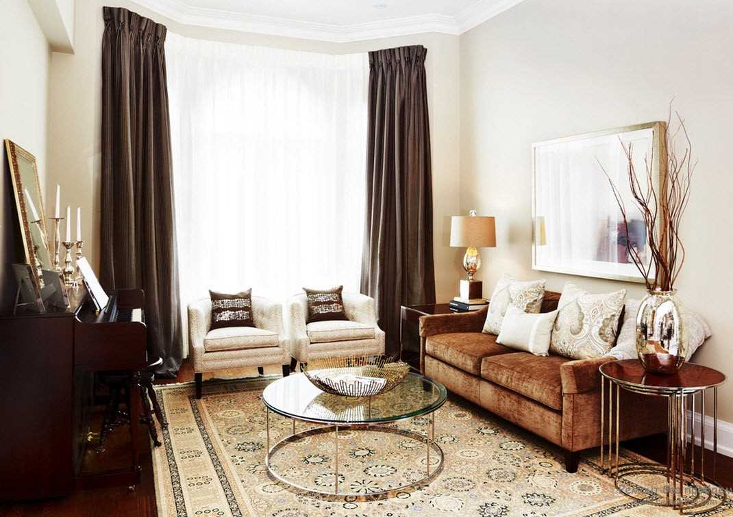
The design of the living room is made in chocolate color with a large picture on the wall.
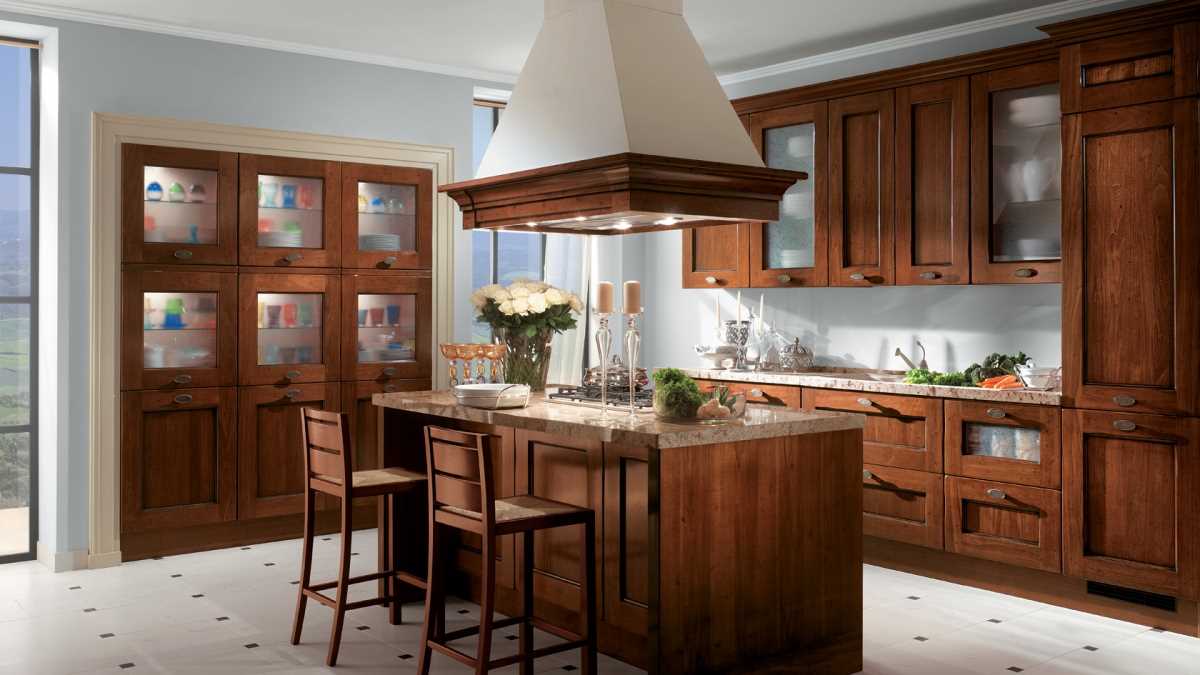
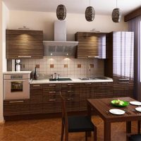
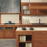
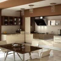
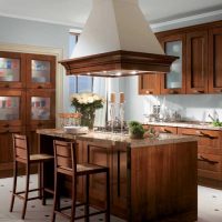
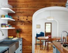
The rich brown color in the kitchen creates an unusual atmosphere.
Combinations of brown with achromatic colors
Achromatic is a neutral, colorless hue. They differ among themselves only by lordship. They do not have a specific spectrum or its varieties. The second is considered calm. Thanks to what, the interior becomes the embodiment of stability, solidity and reliability. It is popular with business, serious people. In any manifestation, it looks great with achromatic.
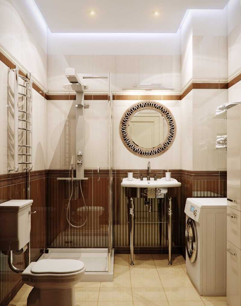
White color combined with brown in the interior of the bathroom looks fashionable and modern.
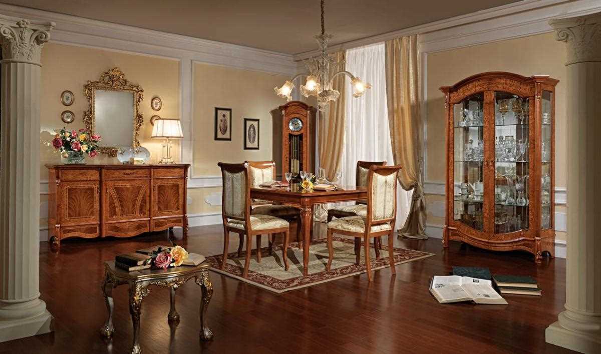
Brown can be combined with many colors.
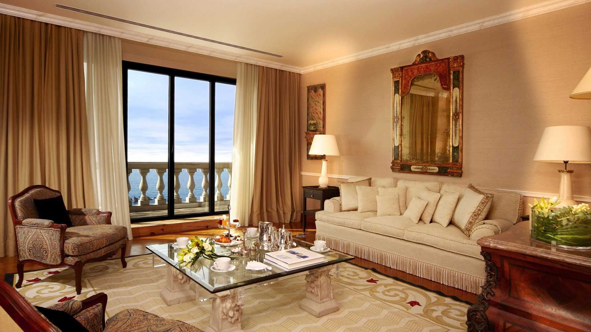
Brown is best combined with light shades.
Brown and black
Black is universal. But with this combination of these particular colors, everything will look rather gloomy.This is due to the minimal contrast of the compound and the lack of great expressiveness. But this only applies to the dark. Therefore, if you want to create a design in such a tandem, prefer light ones like sand or beige. This will not overload the situation. Fit and saturated. After all, black refers to achromatic. Therefore, it does not have saturation, and, combining other tones with it, they must have brightness.
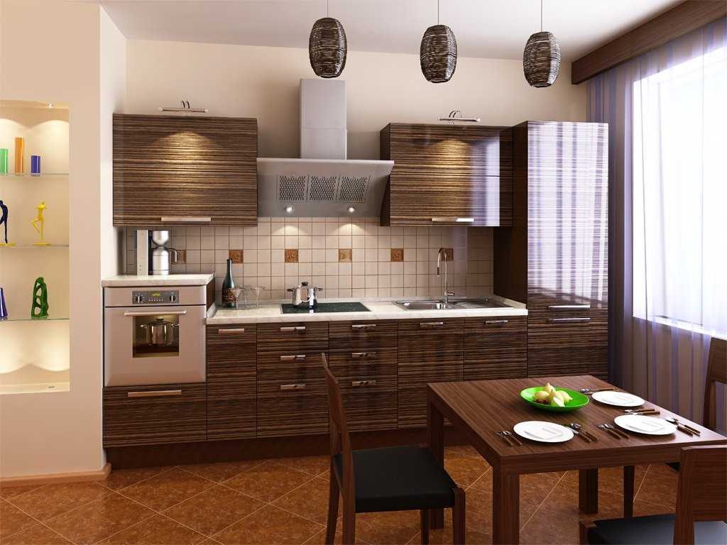
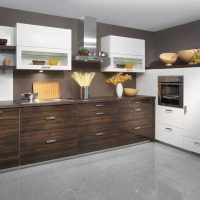
Imitation wood in the kitchen will look very beautiful
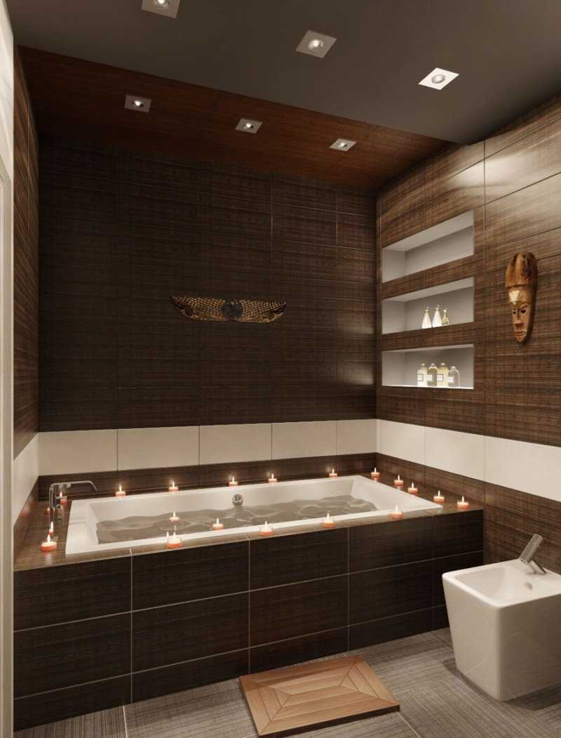
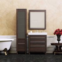
The design of the bathroom is made in chocolate color with wall decoration with porcelain tiles
Brown and gray
It is recommended to use light gray of various intensities, wishing to embody such a connection. This creates a sharp contrast in the selected gamut. It is important not to combine warm and cold shades in one style. For gray with a blue, pink tint, grayish, pinkish brown and others are suitable. The same rule applies to warm tones.
Brown color with chromatic tones
Chromatic are those that the human eye can discern in the spectrum. Those that are visible in color. They can be determined by tone, brightness and saturation. Paired with them, the second, characterized by rigor, restraint, is literally transformed when chromatic shades are added to it.
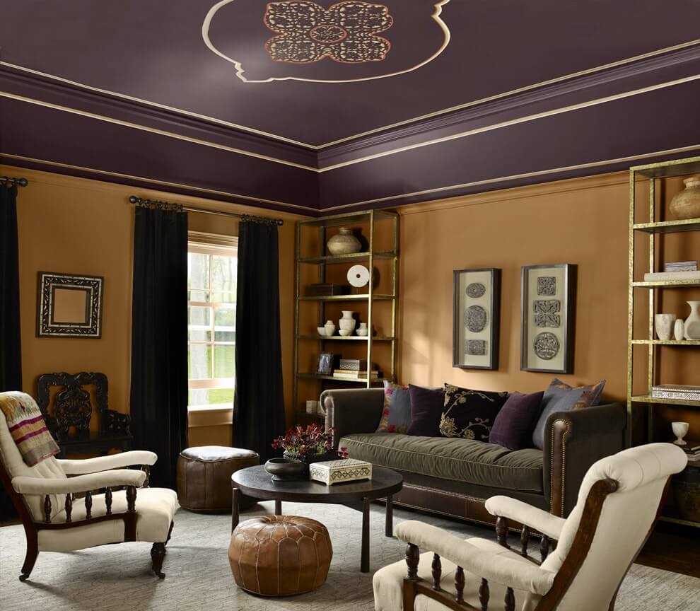
Brown can be combined with many colors.
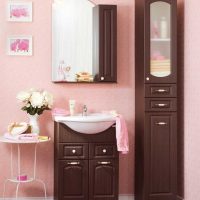
The design of the bathroom is made in one color scheme.
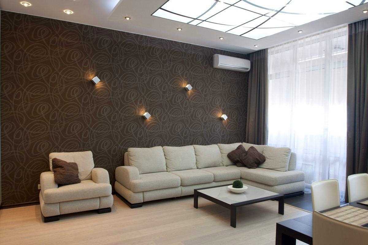
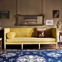
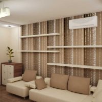
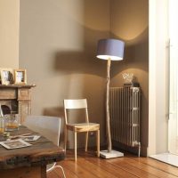
a light sofa against a brown wall will look very beautiful
The combination of a brown "umber" with black and other colors
Umbra is a rich shade, which is distinguished by excellent interaction with a warm palette. To create a gentle design, the umber should be crossed with a pastel tone, restrained brightness. Mixing with warm green creates a positive aura. It will be comfortable and pleasant in such a room. You can add blue in a bright design as accents.
Umbra with deeper bed tones is also suitable for interior decoration. If you want to get a touching and a bit rude design, then use this recommendation.
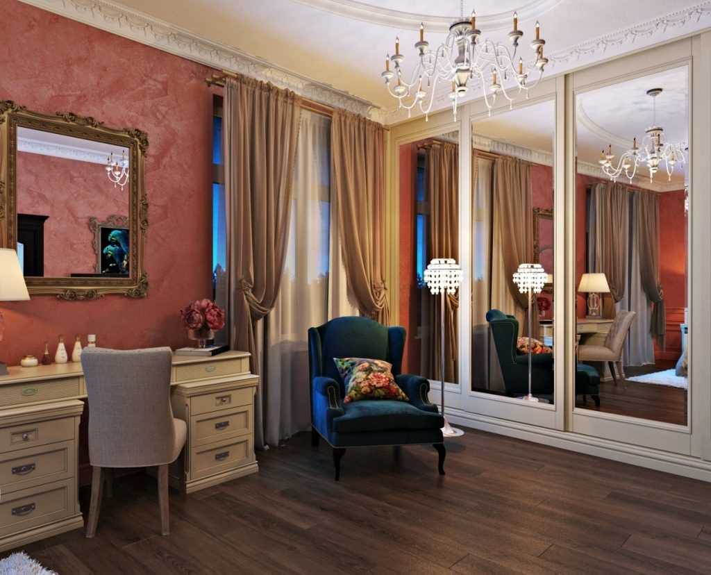
For competent selection of colors, you can use the color wheel
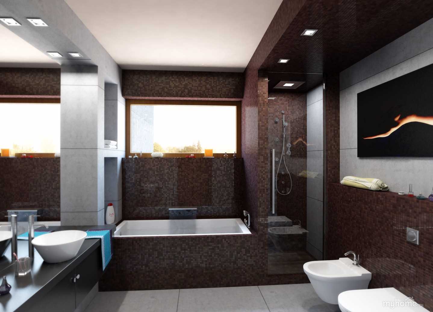
The design of the bathroom is made in brown with mosaic wall decoration
Brown color "bolus" and its combinations
A bolus is a shade that has a light tint. It is distinguished by moderate warmth, accuracy and style. Unique in its kind, it is able to create a confident and beautiful design.
His adherence to others always looks interesting and expressive.
Want to increase the amount of light in the room? Combine the bolus with gentle and calm tones. It will turn out a very attractive design. Soft yellow embodies warmth and positive. With it, you can create a summer mood in the room for the whole year.
Bright bedding is literally created for the embodiment of spring in the interior. If you want a more relaxed option, add yellow. Suitable for bolus blue in a variety of options. It all depends on your personal desires and likes. You can experiment with the palette and create unique and beautiful interiors.
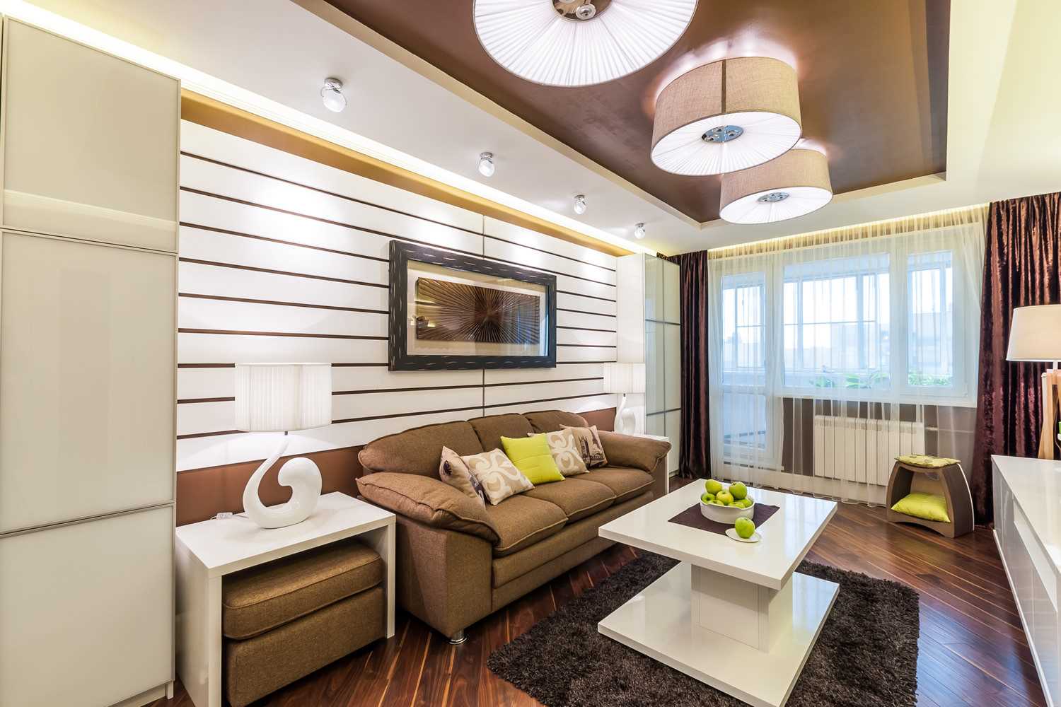
The combination of white and brown in the interior will create a special atmosphere.
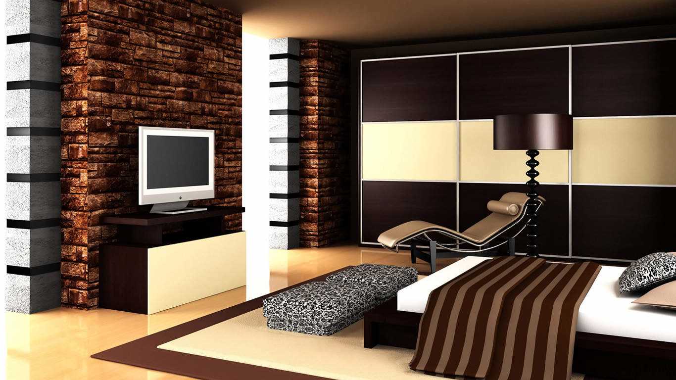
The combination of brown and cream color in the interior will look very beautiful
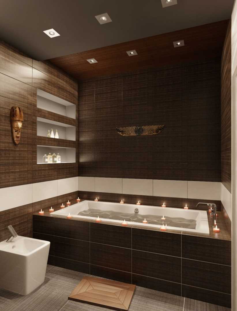
The design of the bathroom is made in chocolate color with wall decoration with porcelain tiles
Brown taupe combinations
Taup is considered a stylish slightly light shade. Adding it to rich and colorful colors, you can get a beautiful design. Experiments with various compounds will help to realize the interior for any room.
To fill the room with positive emotions, add bright and warm tones to the taup. A pastel palette helps create a sunny mood. Muted shades also look quite natural and beautiful.Red will add sophistication to the room.
To add to the room maturity and severity will help adding dark saturated green. Complete the result with light accents. Purple allows you to create a stylish and smooth image in the interior. Saturated blue brings freshness. Taup and cream embody the touching and delicate style, more girlish. For contrasting interior use white details. Add tenderness and some lightness with bright but gentle tones.
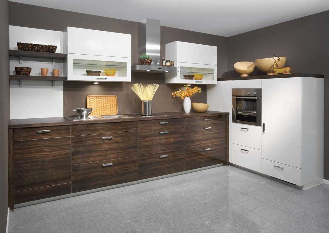
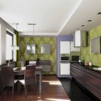
The combination of brown and gray in the interior of the kitchen looks very beautiful and modern.
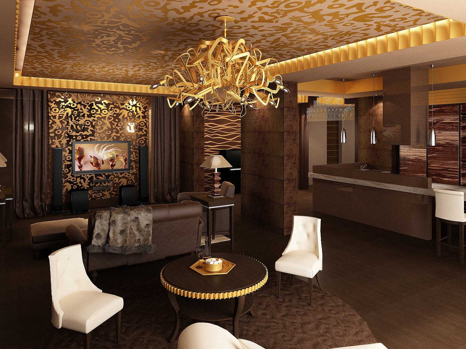
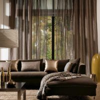
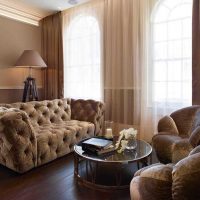
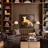
The design of the living room is made in chocolate color.
Chocolate, coffee and other colors are the embodiment of rigor and reliability. They are usually perceived as one of the main options for office outfits. But he is able to transform any room. With the competent addition of other tones, you can create original and unique designs that will differ in lightness, beauty, comfort. It is only important to make a tandem correctly so that everything is harmonious, beautiful and elegant. Do not take such a gamut as a palette only for rigor, business and boring options.
If you want to embody a design that is conducive to tranquility, relaxation and a pleasant rest in the circle of close people and friends, then such a gamut fits perfectly into the above. It is associated with natural, natural materials. The palette looks great with orange and green. It makes them more juicy, does not overload, balancing the brightness. The range of land and wood brings warmth and peace to the room. Therefore, it is a suitable option for home improvement, in particular the living room and bedroom.
Video: Beautiful color combinations. Brown colors
