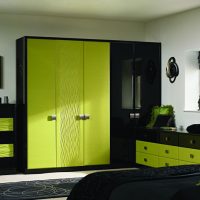
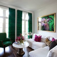
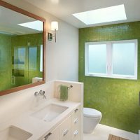
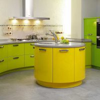
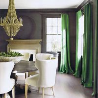
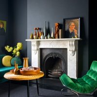
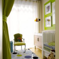
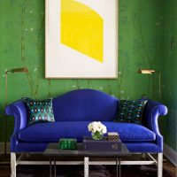
The possibilities of green in the interior and the rules for combining with other tones
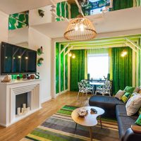
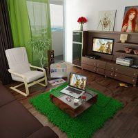
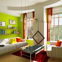
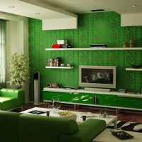
Color is one of the most powerful tools that the creator of interiors has. This is especially true of modern minimalist styles, but true for classics filled with details.
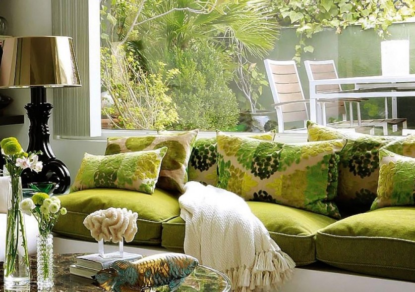
Green color is considered the most pleasant for human eyes.
The pursuit of naturalness is a trend in modern design. Eco-style, natural materials, natural tones are now in fashion. This is a normal reaction to the rapidly becoming more technically sophisticated world. I want to at least relax and relax at home. Accordingly, the coloristic concept of interiors performed by leading European designers is increasingly based on natural shades. In particular, in green.
Content
- 1 The possibilities of green in the interior
- 2 Green color in the interior as the main
- 3 Bright green accents in the interior
- 4 The combination of green in the interior with other shades
- 5 Green in the interior combined with green
- 6 What coloristic combination is better to refuse?
- 7 Green color in the bedroom interior
- 8 Green as the basis for the design of the guest room
- 9 Fruit and salad kitchen interior
- 10 Video with examples of interior design in green
- 11 Photo: Combinations of green with other colors
The possibilities of green in the interior
Green would not become a popular trend if it did not provide so many interesting opportunities. It is permissible to use it in the following qualities:
- The basics. In very light, close to white, and dark modifications, green is perceived as neutral. This means that it can be taken as a central one, painted with it on large surfaces, entire walls.
- Bright accent. In the most intense variations, green is used to create contrasts, expressive accents. For example, this applies to saturated light green or deep aquamarine.
- Complementary color. Green gloriously manifests itself in combinations. Moreover, the range of possible combinations is very wide. In cold and warm versions, color behaves differently, and therefore has an extensive list of shades with which it can be friends.
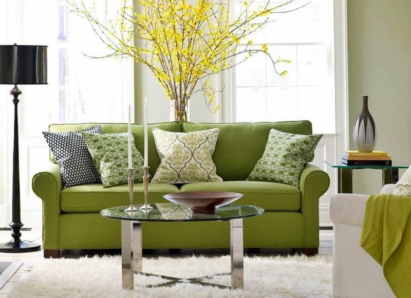
Green is best combined with neutral, natural shades.
Green color in the interior as the main
The main color in the color image of the room is the one that is used as the background. It covers the surface of walls, floors or ceilings. It happens a lot, and it should not be annoying, be too concentrated.
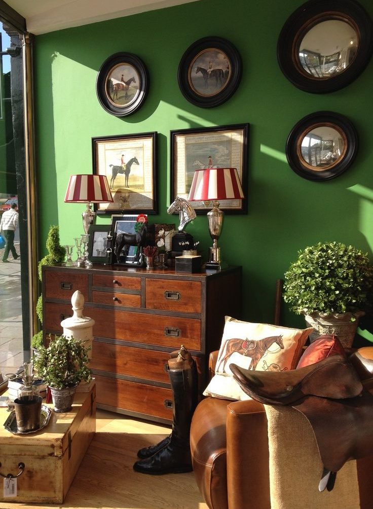
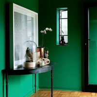
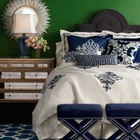
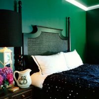
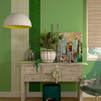
A brown wooden chest of drawers against a dark green wall looks stylish and aristocratic
Traditionally, such a basis is sepia, white, light gray, dark brown. However, green can also successfully cope with this task. You just need to choose the right shade. As such may be:
- muted olive;
- very light blue-green tones;
- black with a green tint (this shade is also called the "color of the night forest");
- and other close tones.
True, the dark base is more likely to be applied in leisure facilities, bars, and theme cafes. For housing, this, in most precedents, is a rather difficult choice requiring courage.
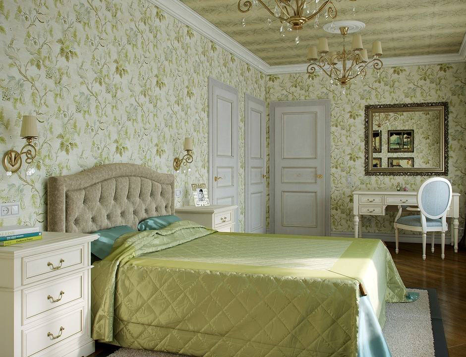
Green color is used in the design of rooms of any stylistic direction.
Bright green accents in the interior
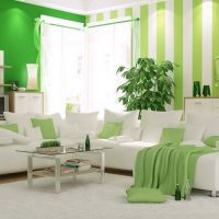
Intense light green, juicy blue-green color, herbal - these shades can become expressive green accents on a more neutral and restrained background.Having picked up textiles, decor, curtains, furnishings in this palette you will revive the room.
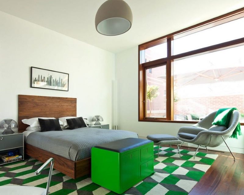
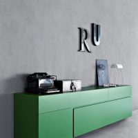
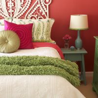
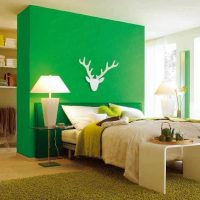
Bright green nightstand in a white bedroom
The combination of green in the interior with other shades
Different types of green are friends with a wide range of shades. The most common combinations are described below:
Red
This is a highly active color, which is recommended to be used with care when arranging premises.
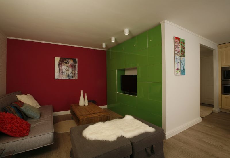
Red color is aggressive and energetic, but in combination with dark tones of green it becomes just an additional paint
It interacts with those shades of green that effectively act as basic. That is, with light, whitened. For example, a fresh and stylish pair is cold burgundy and gray-green in their most delicate manifestations. Deep wine color and muted light green are perceived wonderfully together.
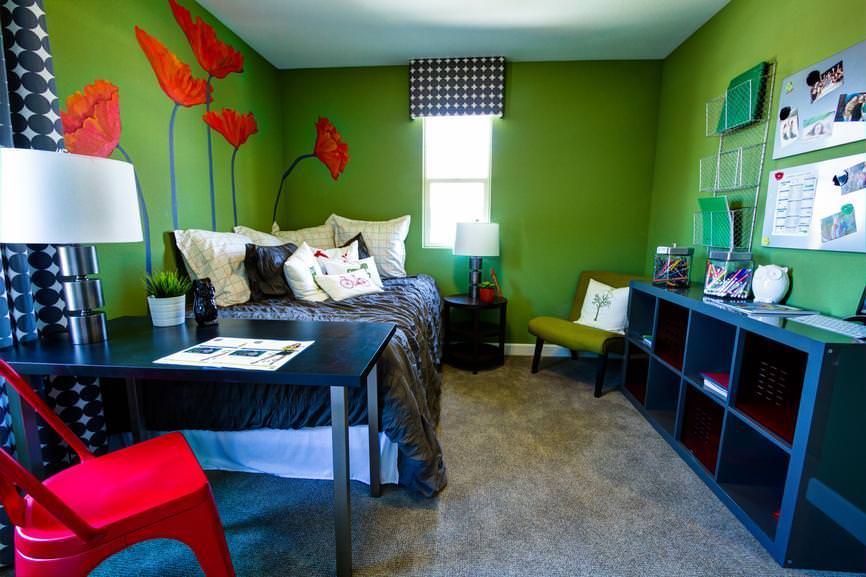
As a background, green is usually chosen, and red plays an accent
In such a range you can design a living room or kitchen, but you should not use it for a bedroom. For gaming, it is permissible to use these two colors even in bright versions, however it is important not to overdo it, softening them with a suitable third tone. For example, gray or white.
Pink
Innovators among designers are now rediscovering pink. In extremely soft varieties, it successfully acts as the main one. And its rich shades are suitable for temperamental catchy accents, curtains, decorations.
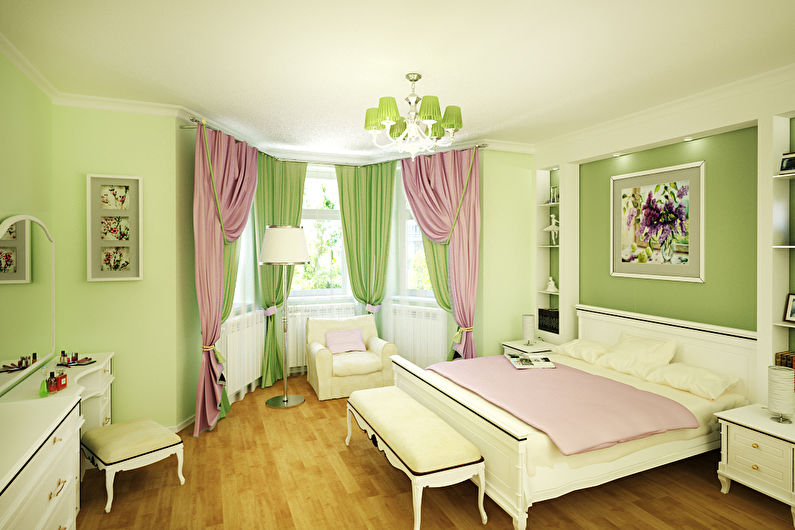
A successful combination of pink and green curtains in the interior of the bedroom for the girl
Pink goes well with a variety of shades of green. For example, gloomy, muffled greens begin to glow almost when placed in a room next to a large, delicately pink wall. You can take more candid combinations: cold coral looks great with blue-green.
The combination of these colors can be used for any type of room in the house.
Orange
Orange is hard to muffle. Even diluted with light coloring pigment, it continues to visually dominate the space of the room.
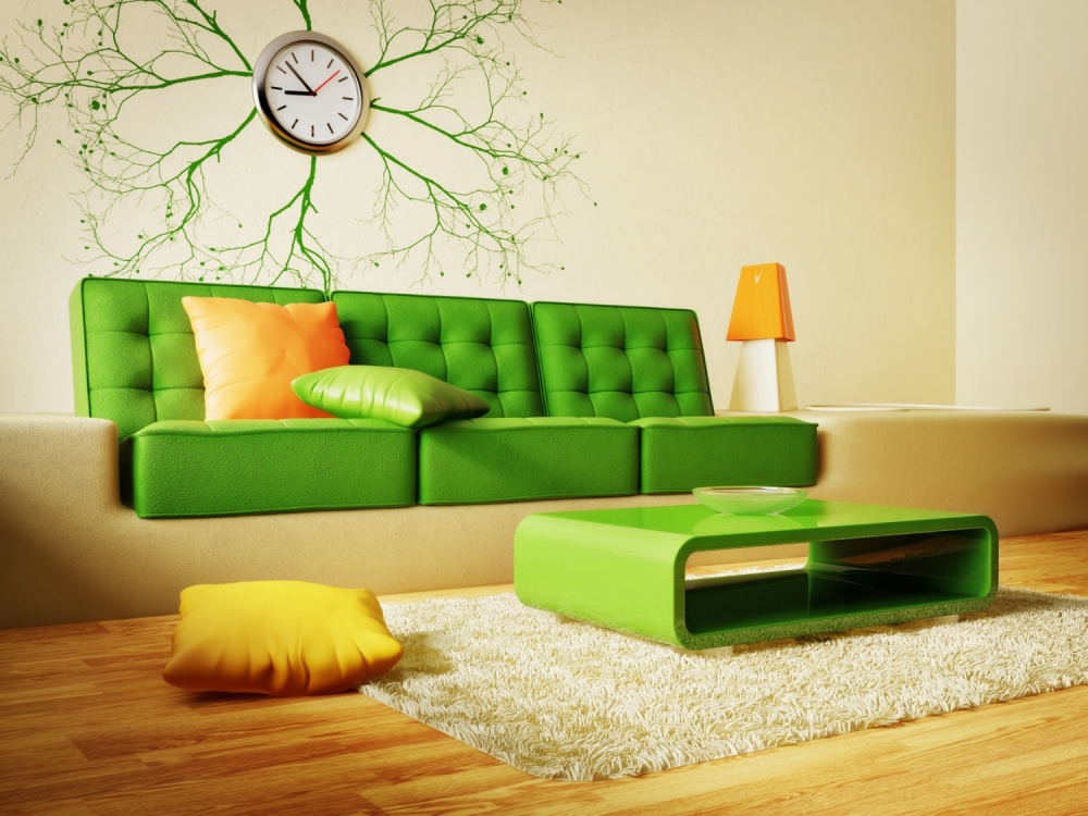
A juicy combination of orange with green will add a good portion of joy to the interior
With green, this cheerful color interacts wonderfully in any temperature gradation. In combination with redhead, it is permissible to take turquoise, olive, lime, bluish green and so on. The main thing is not to overdo it and not to make the interior too active.
This reliable ally of green color is irreplaceable in the design of the living room, kitchen, dining room, and nursery. Most likely not suitable for a bedroom that requires a more relaxed approach.
Yellow / gold
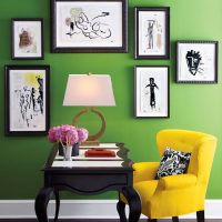
Joyful sunny range will add comfort to any interior. But it is rarely used as a base, background color. More often it is a shade of furniture, fabrics, accessories.
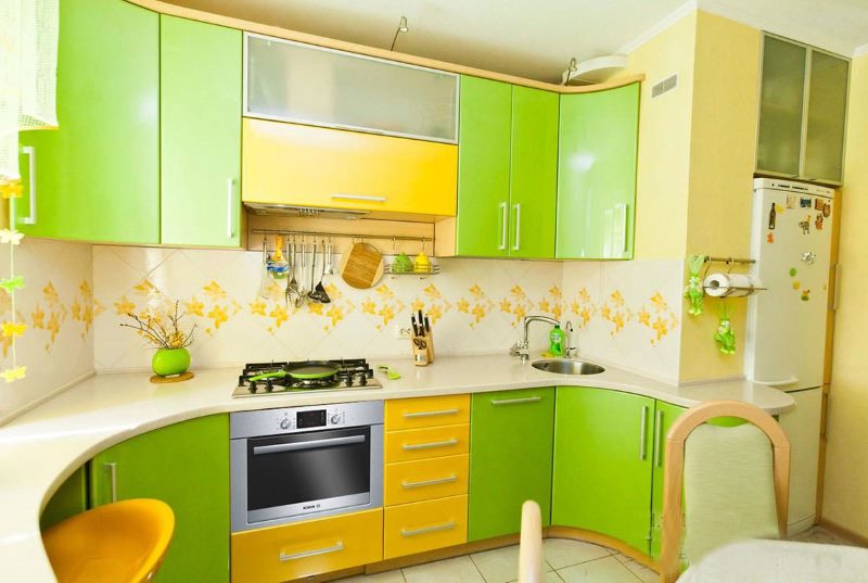
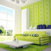
The yellow-green palette will make the room visually spacious
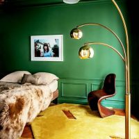
Yellow and gold are wonderfully complemented by warm green elements. These related paints work wonderfully together. Especially if you add brown, beige or gray to this partnership.
This is a great way to color the bedroom. However, for other types of premises it is also applicable.
Beige
Connoisseurs of naturalness often prefer beige as dominant. It is quite neutral and close to nature, causes a feeling of peace.
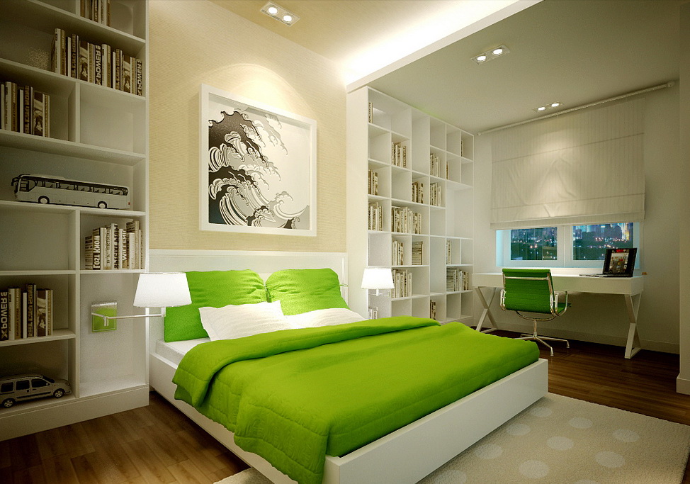
Bright green accents in a bedroom with beige walls
The combination with green enhances this effect. And in this situation, you can take almost any shade of green: warm or cold, nuance or screaming. It will work anyway. Designers even call this combination of colors "the triumph of nature."
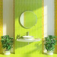
Any room, as a rule, looks good in this color scheme: living room, kitchen, library, bathroom.
Brown
Wood or its imitation are an integral part of almost any stylish interior.And this usually means brown as a significant part of the image of the home.
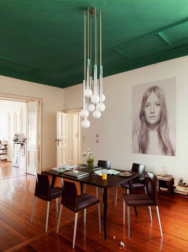
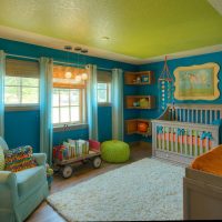
An interesting combination of brown flooring with a green ceiling
In combination with green, it looks very effective. It is most often used with warm shades, but it can also form a harmonious partnership with cold ones. The union of dark brown and emerald green looks solemn and deep. True, this is a rather heavyweight combination, it should be used carefully.
In various versions, this pair can function effectively in any room, from the bedroom to the nursery.
Blue
A soothing cool blue visually expands and deepens the volume, if used for the background. In more saturated variations, such a color is able to work as a bright spot that attracts attention.
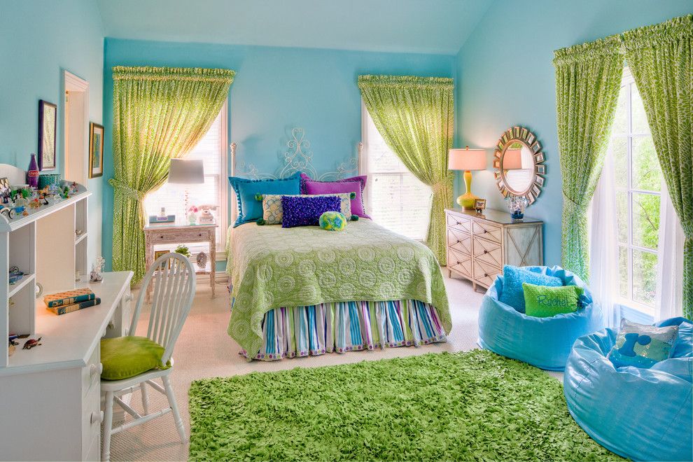
The combination of green textile with pale blue walls is great for decorating a kids room
The most important advantage of combining green with blue is the chance to play with palettes of different temperatures. That rare moment when you can take a pistachio filled with sunlight, add it to the icy blue and get a balanced result.
Such a pair is best suited for decorating a bedroom, living room, dining room, bathroom. Kitchen and nursery, as a rule, require more intensive solutions. However, there are exceptions.
Blue
Most often, this bottomless color is used in interior design in its darkest and most deaf versions. However, in a pure uncomplicated form, he also has the right to exist. Blue accessories contrasting with a more neutral environment, decorative details, pillows often look very impressive.
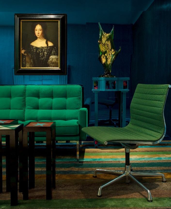
Dark blue in combination with green looks strictly and is not suitable for everyone
Together with green, this paint is at a height only when there is their penetration into each other. That is, when thick greens have at least a subtle blue tint. And in the sky-cobalt, the presence of a green coloring pigment is felt. Such combinations are very beautiful, but it is difficult to apply them. Not every professional designer decides on this.
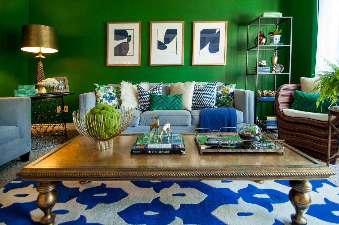
The blue-green combination can be diluted in white, gray or beige.
This coloristic harmony is perfectly suitable for the living room or bedroom, less often - for the kitchen or the game room.
Violet
Vigorous and a little heavy purple reveals its potential in contrast. White, beige and yellow successfully complement it.
Just like green. Especially its warm and bright variations, such as lime, olive, lime.
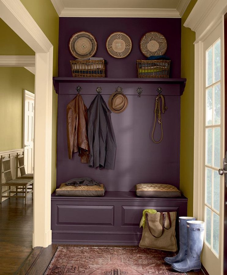
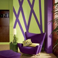
The combination of green and purple is suitable for the hallway
Like any contrasting solution, this color pair requires delicacy. It is effectively perceived in leisure facilities such as bars and cafes. But in a residential building, this combination is better to save for the living room. In other places, it runs the risk of being overly catchy.
White
White and paints close to it are present in almost every interior. They expand the volume, they are perfectly combined with almost any segment of the spectrum.
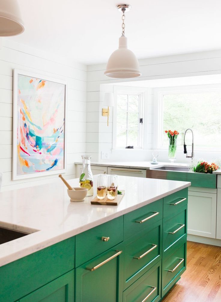
The classic white-green combination looks beautiful and cheerful
In combination with white, it is better to use more intense types of green, both warm and cold. Muffled paints in such circumstances can lose a fair amount of expressiveness.
Such a color combination is appropriate for all functional types of rooms.
The black
Deaf black, in principle, is rarely found in interiors in its purest form. More often, it has a subtle tint, gray, green or brown. It must be used carefully. You can, for example, paint one of the walls in black. Choose a spectacular dark furniture. But it should never be too much, especially in the living space.
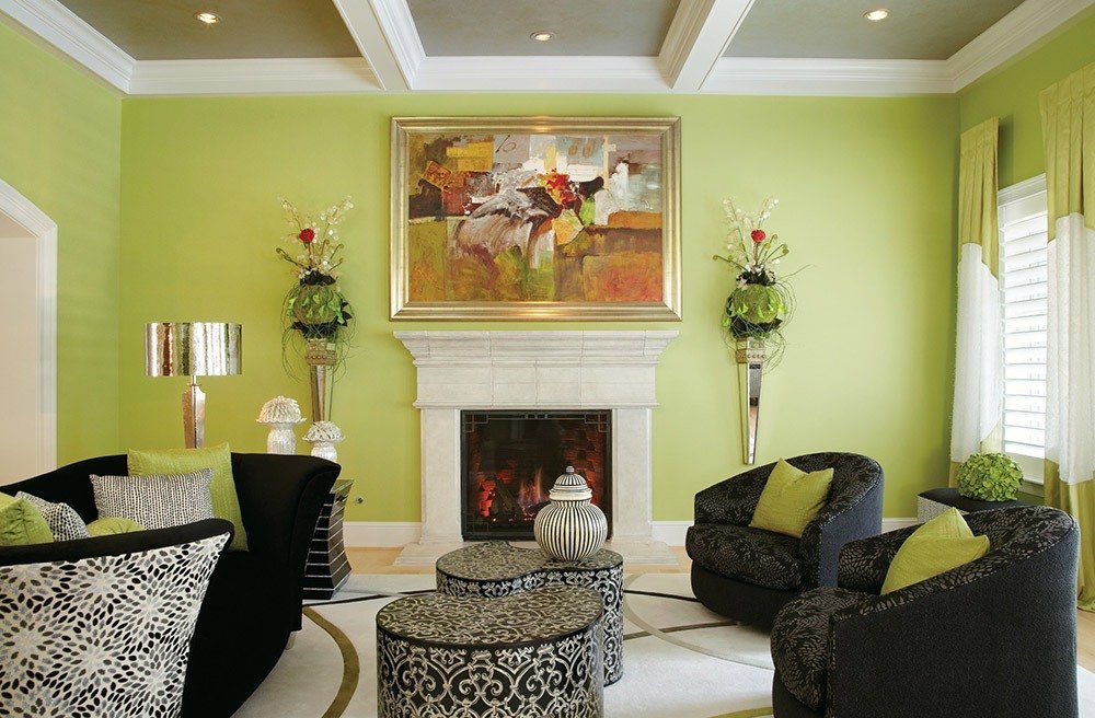
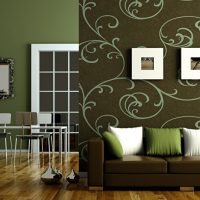
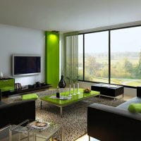
A stylish combination of black upholstery with soft green wall decoration
With green, black usually works in contrast. Bright yellow-green sofa upholstery and the same curtains work perfectly with dark glossy floor tiles. Black polished material next to emerald details looks expensive.
Such a combination will fit harmoniously into the living room, but for other rooms in the apartment it will be hard.
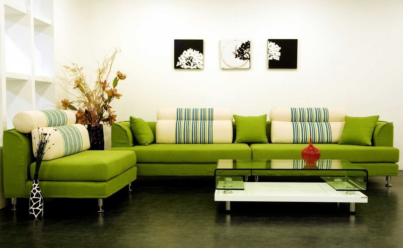
You can choose color combinations from your preferences
In short, the green color in the interior has a wide range of features.
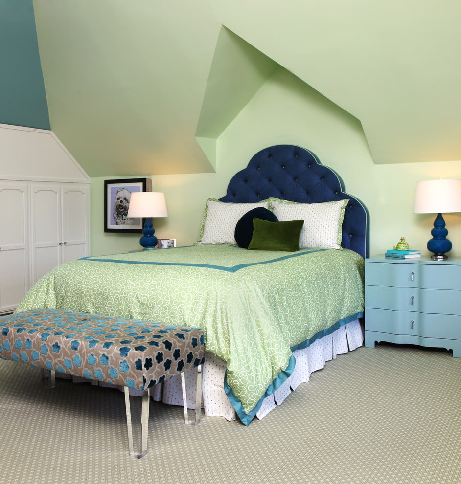
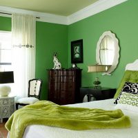
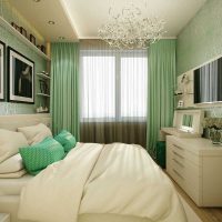
The skillful use of green shades in the bedroom will create a pleasant atmosphere for relaxation.
Green in the interior combined with green
Do not forget about the potential of combining different editions of green. From the table below it is clear which color versions are in harmony with each other and which are not.
| Tones | warm dark | cold dark | warm whitened | cold whitened | warm spectral | cold spectral |
| warm dark | + | – | + | – | + | – |
| cold dark | – | + | – | + | – | + |
| warm whitened | + | – | + | – | + | |
| cold whitened | – | + | – | + | sometimes | + |
| warm spectral | + | – | + | sometimes | + | sometimes |
| cold spectral | – | + | – | + | sometimes | + |
As can be seen from the table, it is most reliable to combine the paints of the same temperature regime together. Sometimes there are combinations of green, not observing this rule. However, this is rare.
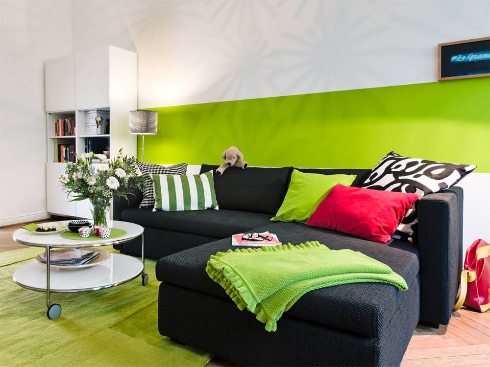
Most shades of green are rich and vibrant tones.
To finally determine whether the color scheme has been successfully selected, refer not to the table, but to your own taste and vision.
What coloristic combination is better to refuse?
Caution should be exercised with respect to temperature contrasts. Much has been said about this above.
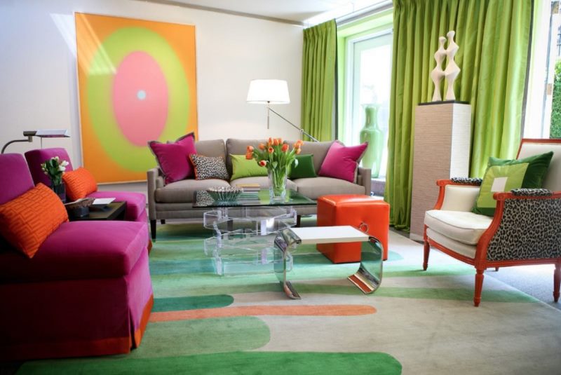
The abundance of bright accents can cause discomfort
Combinations of several catchy colors are also doubtful. Not all of them fit together. Especially if you use more than two of these colors in your palette.
Green color in the bedroom interior
The sleeping room should be a calm, restrained place. That is why it is preferable here to avoid sharp contrasts, aggressive colors, such as red, purple or orange.
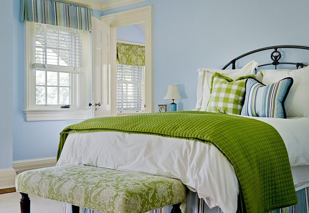
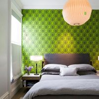
Green accessories will add brightness and freshness to your bedroom.
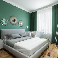
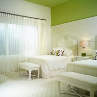
But green, beige, white, brown in various readings are ideal here. Probably because these are very natural tones. The main thing is not to forget that the final composition in these circumstances should be based on nuances.
Green as the basis for the design of the guest room
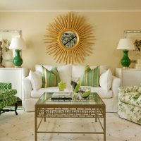
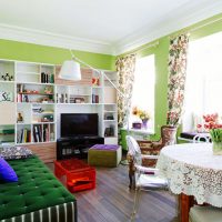
The interior of the living room can be solved in different ways, its design involves a certain freedom. However, green is most often a good idea in this situation. Even such trifles as green curtains, posters, bedspreads very refresh the room, make it more lively and light.
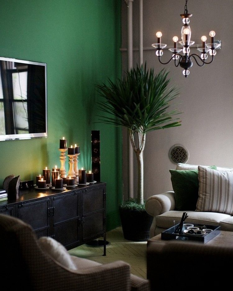
A beautiful and rich combination of green with pastel gray in the interior of the living room
Fruit and salad kitchen interior
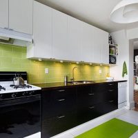
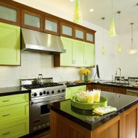
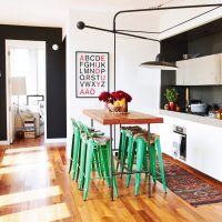
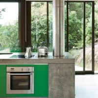
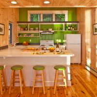
Warm and light green samples, according to scientists, stimulate appetite. That is why their use in the kitchen looks very natural and harmonious. In combination with white, orange, lemon; fruity or floral prints produce a soft, comfortable atmosphere.
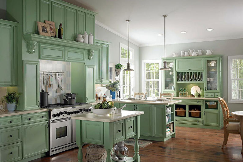
Mint shades are great for decorating a Provence style kitchen.
The green color in the interior is the source of a huge number of original ideas.
Video with examples of interior design in green
