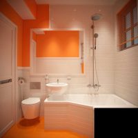
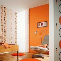
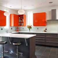
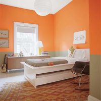
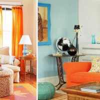
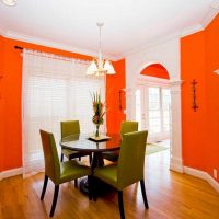
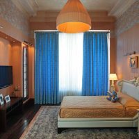
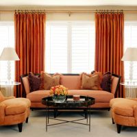
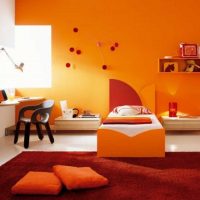
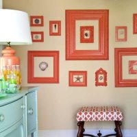
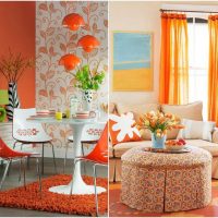
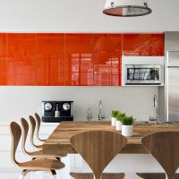
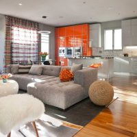
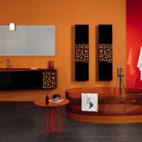
The combination of orange with others
Orange, as you know, can be obtained by mixing red with yellow and, probably, therefore, it is considered the warmest of the spectrum, which has incorporated the properties of the first and second. This shade absorbed the powerful energy of red, but remained as luminous, cheerful, warm, as if yellow. Rather, it evokes in us memories of the cozy flame of the hearth and warm sunshine. Those who discover for themselves the charm of this color will find openness, love of life and activity in it.
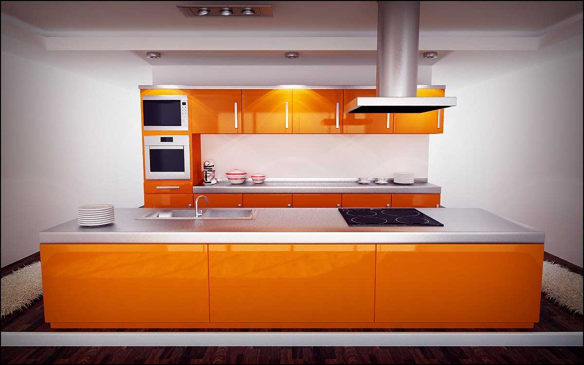
Modern apartment design in orange
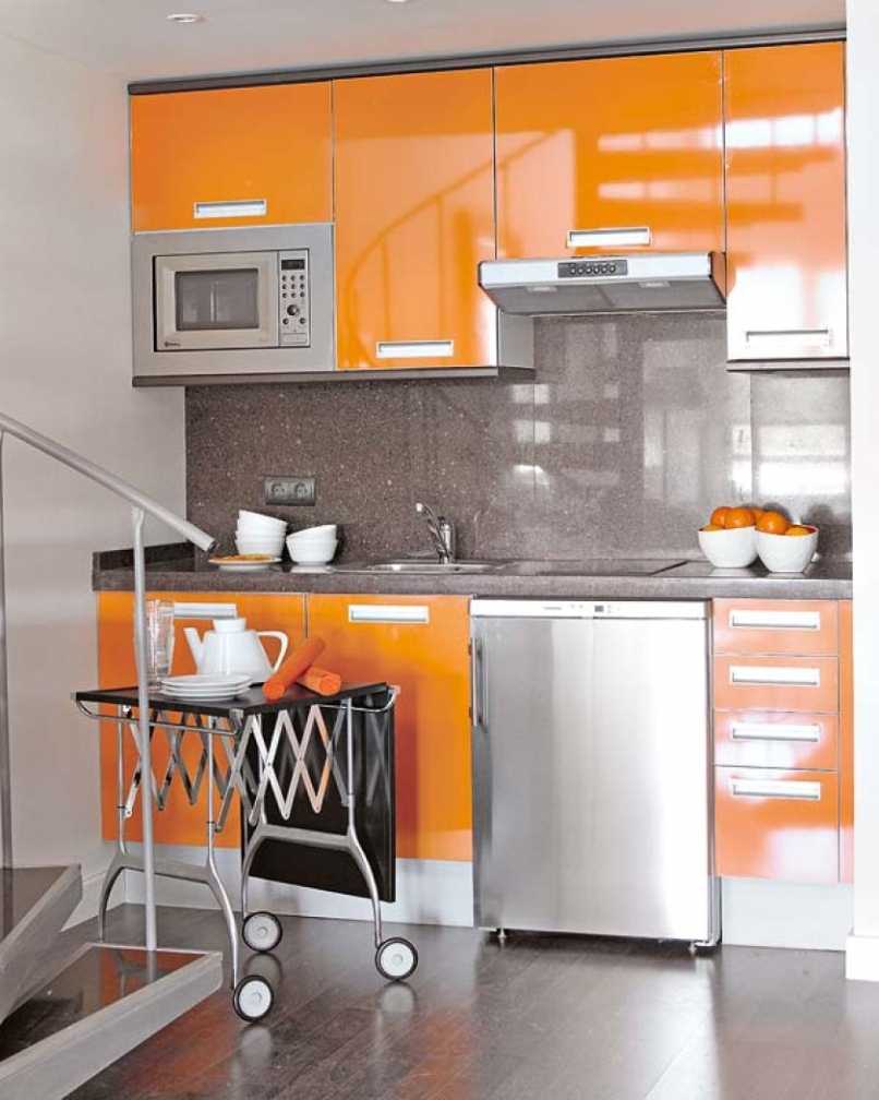
The combination of orange with other colors in the interior
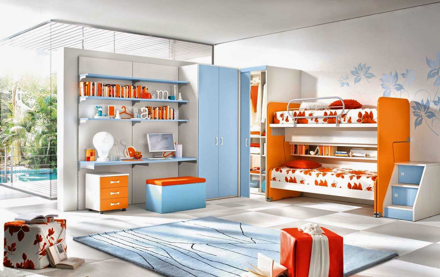
Room interior in orange
Content
All shades of joy: choose your own
Orange has a mass of halftones and the difference between them is expressed in lightness, intensity, and yet they can be divided into several groups.
- Bright orange tones, orange and carrot are the brightest colors that attract attention. Due to this, they are often used in design and interior decoration, because they will bring cheerfulness and festivity.
- Light orange pastel shades are the lightest shades obtained when mixed with white or pink. These colors are perceived as the most natural and natural. White or pink tint gives a calm and harmonious flavor. It can be quite often found in nature - various fruits and plants.
- Orange color with a large share of red undertones (cinnabar) - here the bright tones of red dominate over yellow, they bring more passion and energy, but without the aggression that accompanies pure red. This color has a tonic effect.
- Dark orange - the most calm, deep and rich tones. This “tasty” combination gives an idea of comfort, warmth and autumn. Here, a brown tone dilutes the activity of the main color, giving it nobleness, maturity.
- Yellow-orange, ocher causes a strong association with heat, a rich crop, spike rye, sand. This shade makes us feel calm, while remaining active. Yellow color gives more warmth, and red aggression is neutralized.
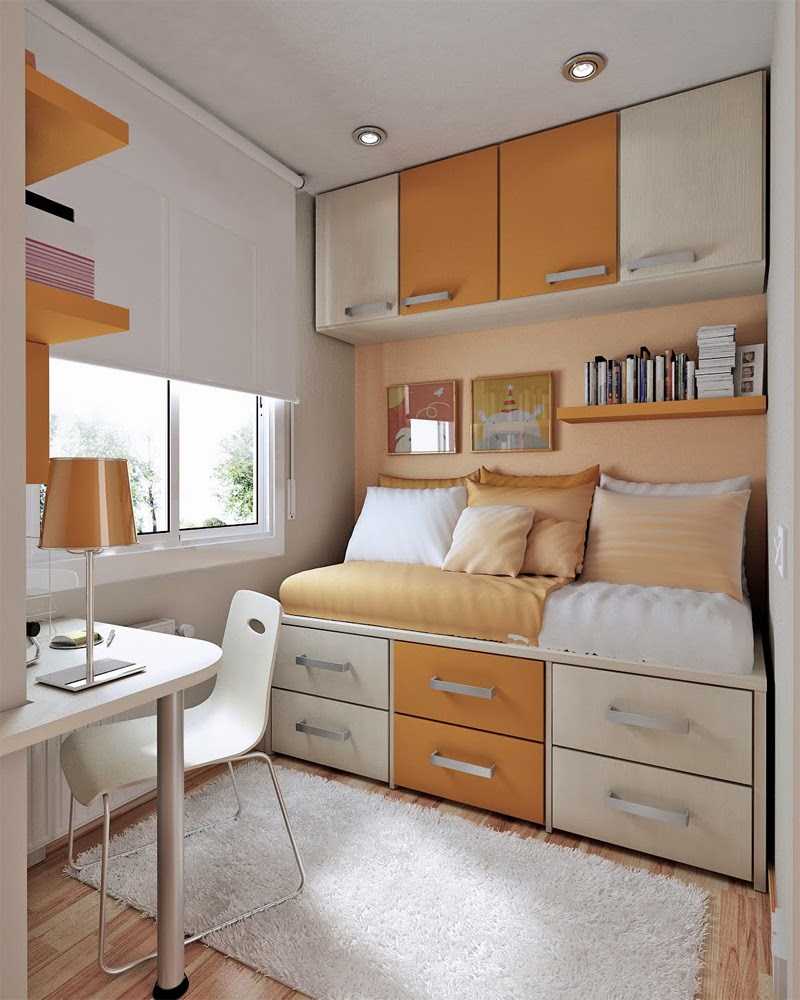
Orange color in the interior in combination with other shades
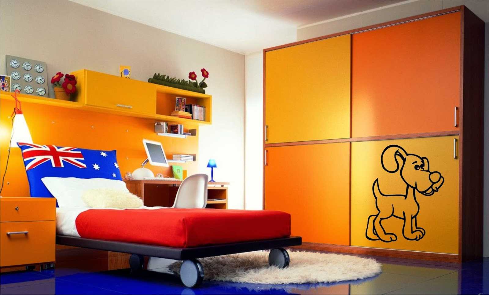
Apartment design in orange color in a combination of other shades
Orange Combinations
Having taken up the description of any color, one cannot concentrate only on it and its characteristics, avoiding it and not considering compatibility with others. Various tones of one shade, of course, can be combined with each other, as well as come up with various combinations with others, which will make it possible to get interesting and successful images, allowing you to achieve the desired effect.
In any combination, a bright orange color brings its warmth and liveliness. A similar color brings to us memories of summer and hot countries; combinations with this shade are more typical for those areas where a hot climate prevails, especially in eastern countries. Complementary colors enhance or support the “pair”, muffling it or even more emphasizing and setting the tone of the combination itself.Particularly well are those combinations in which the second tone is darker than the main tone, due to which this color seems to open, glow.
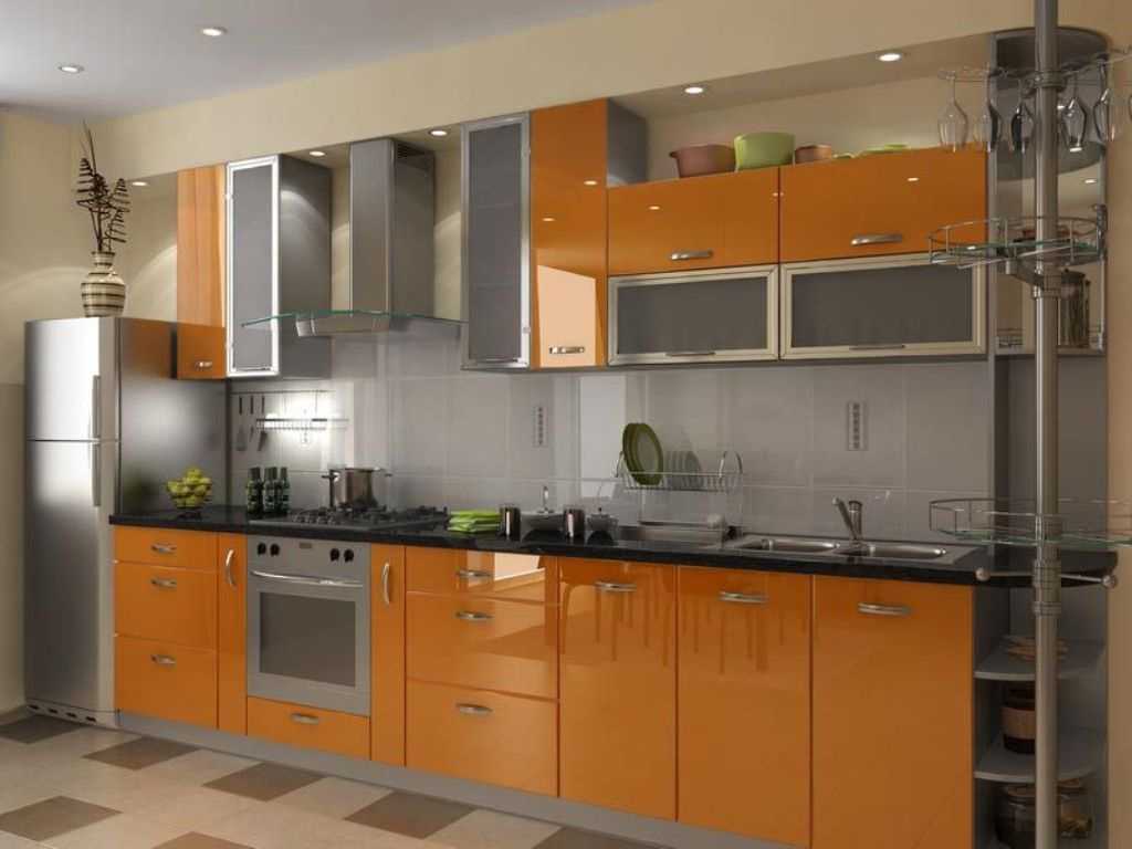
Modern apartment design in orange
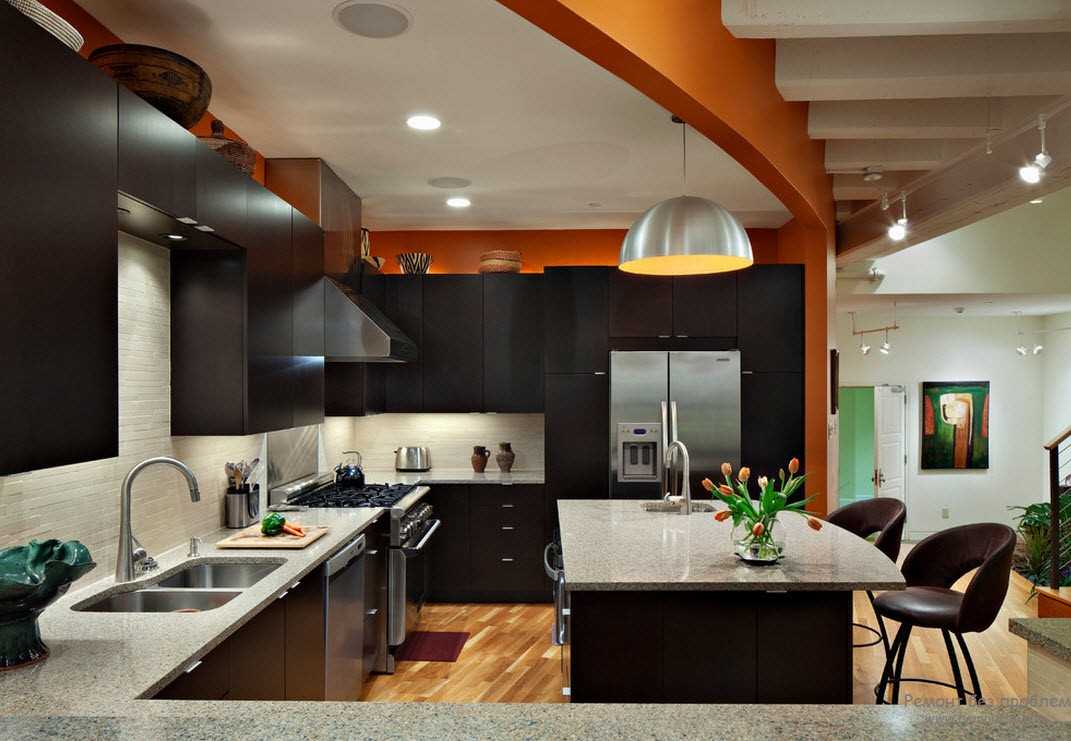
The combination of orange with other colors in the interior
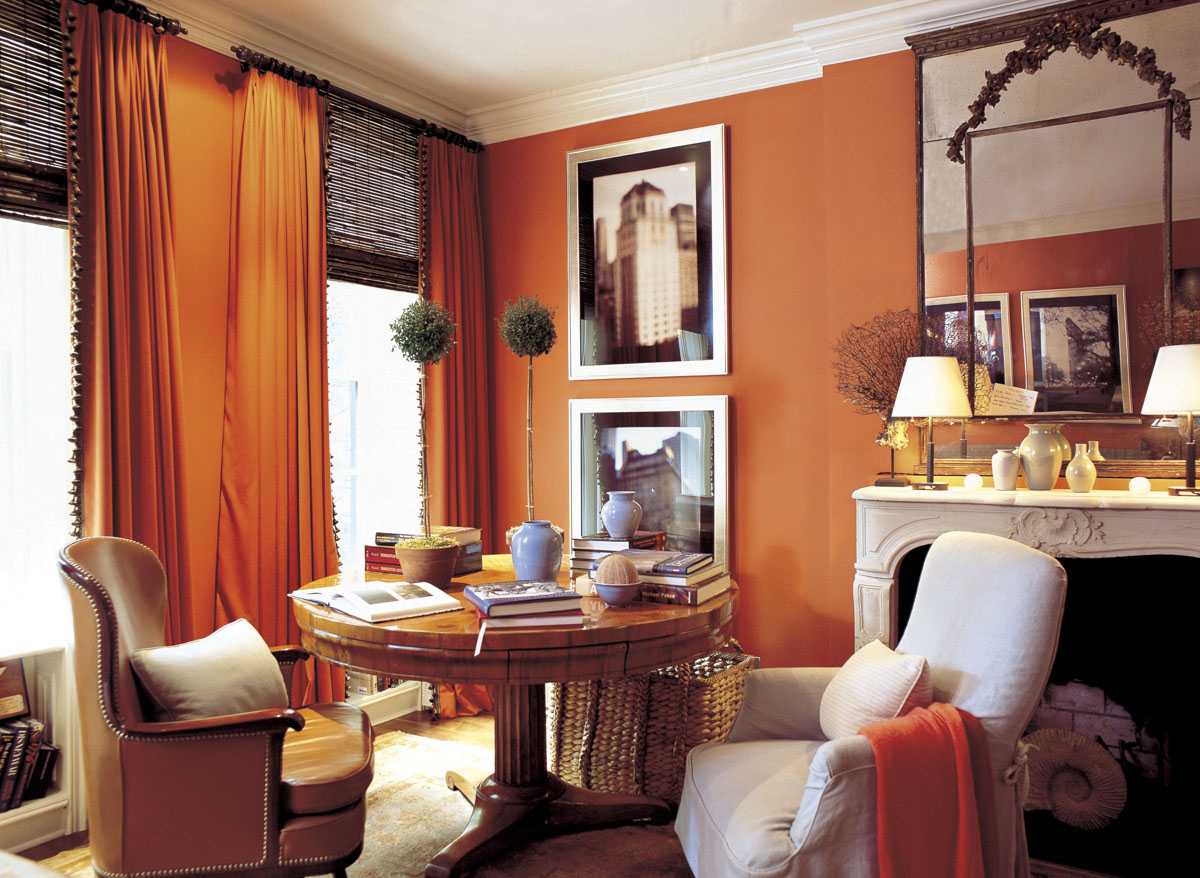
Room interior in orange
Almost any combination with this tone looks advantageous. In combination with this shade, other complementary colors are almost always in contrast. Therefore, many colors can be combined. Bright shades will harmoniously look in a duet with the same saturated colors, and light, on the contrary, with neutral and pastel colors.
And in order not to make a mistake and correctly use bright orange in your everyday looks or interior, you need to know and take into account the compatibility of these colors. There are a lot of successful combinations. White shade, black, gray, blue, pink and many others are perfectly combined with this bright tone.
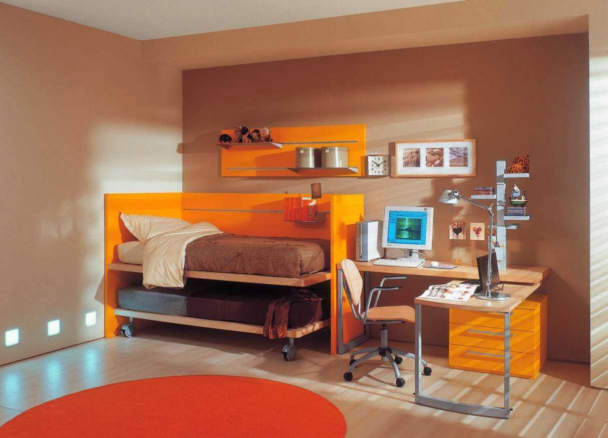
Orange color in the interior in combination with other shades
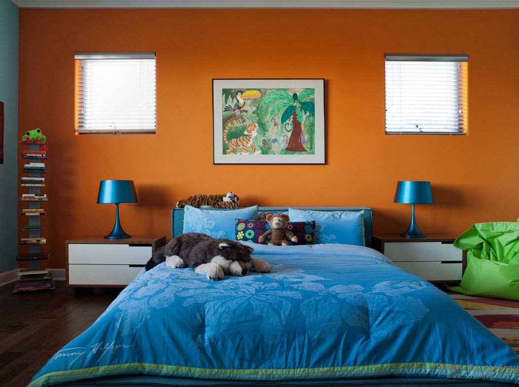
Apartment design in orange color in a combination of other shades
The combination of orange with achromatic
Achromatic colors are black, white, gray and its various variations. Perfectly in harmony with all shades. Orange color combines favorably with black, white and gray due to its brightness and saturation, which is only emphasized in combination with black and white. Such a shade will be a great pair to many neutral shades, especially black, dairy and lead. Light and medium tones calm and muffle its intensity, while dark tones deepen and add a bit of aggression.
The black
The combination with black is one of the traditional classic combinations, in which, due to the brightness of the orange color, black does not look so gloomy. This is a wonderful combination in which the elements of aggression and restrained sexuality are intertwined. A similar combination of bright orange and black is often found in predatory animals in the jungle and looks bright and aggressive, but at the same time such a union does not look too predatory, but is perceived as quite elegant, elegant and modern.
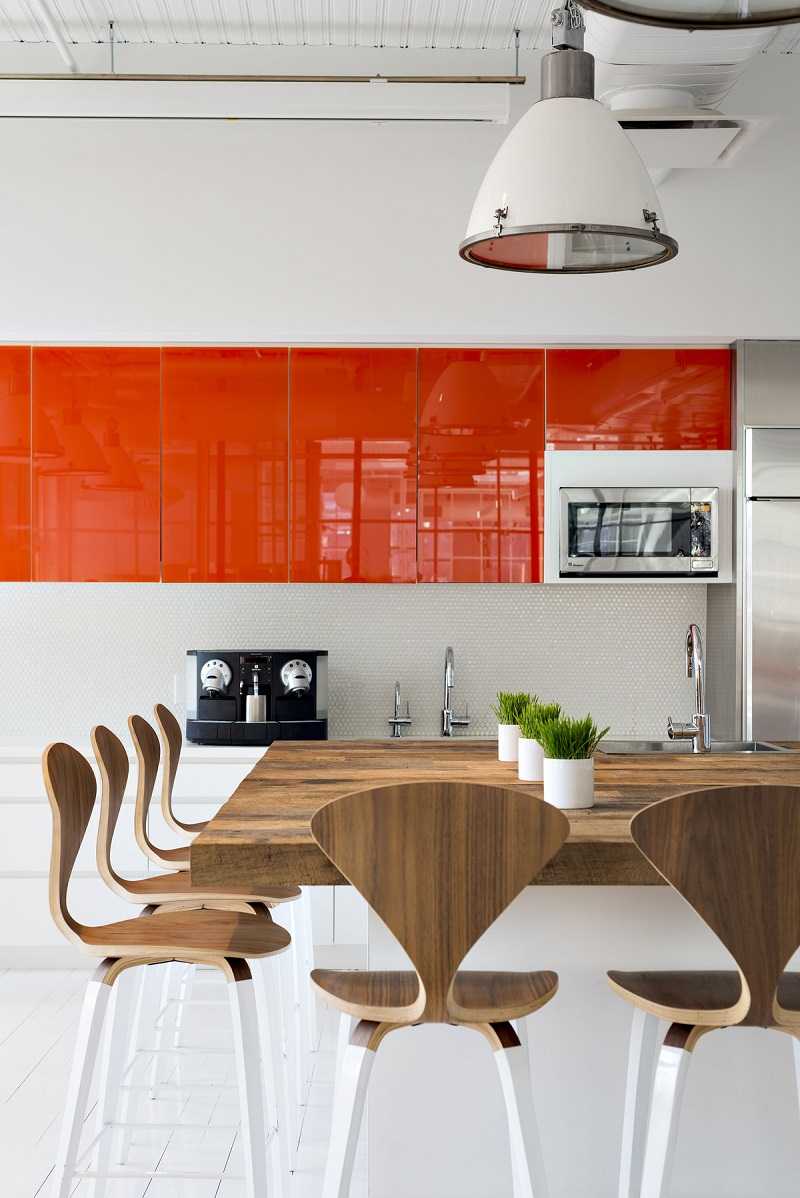
Modern apartment design in orange
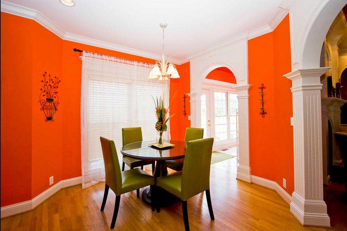
The combination of orange with other colors in the interior
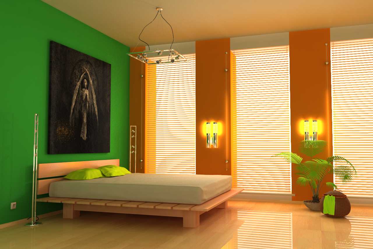
Room interior in orange
Gray
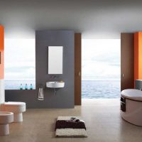
This is a magnificent and successful combination, in which a neutral and austere gray tone can slightly muffle an active, bright and energetic main. Thanks to this, such a union looks elegant and noble, but with all this it is not at all boring. Such an ensemble attracts attention, but is perceived softer than the same combination with black. To achieve harmony, it is better to take a gray of a very light or very dark shade. Light gray will accentuate white, and dark will complement.
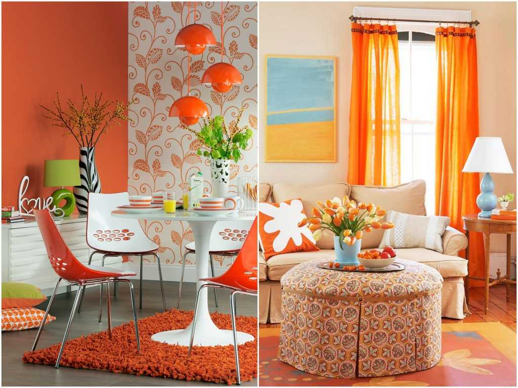
Orange color in the interior in combination with other shades
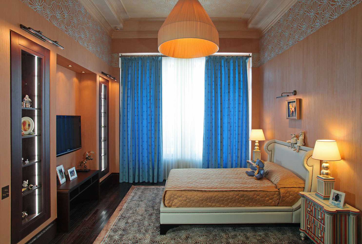
Apartment design in orange color in a combination of other shades
White
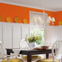
The combination with white is another of the classic combinations. A fairly contrasting combination, where a white hue emphasizes the richness of the dominant color. The presented combination looks optimistic, and the color itself is filled with lightness and vigor.
The combination of orange with chromatic
Orange is one of the seven basic chromatic tones. What other colors does the orange color work well with? The list of successful combinations is quite extensive.
Do not be afraid to choose this shade, because depending on the complementary color, it can be either bright or more restrained.
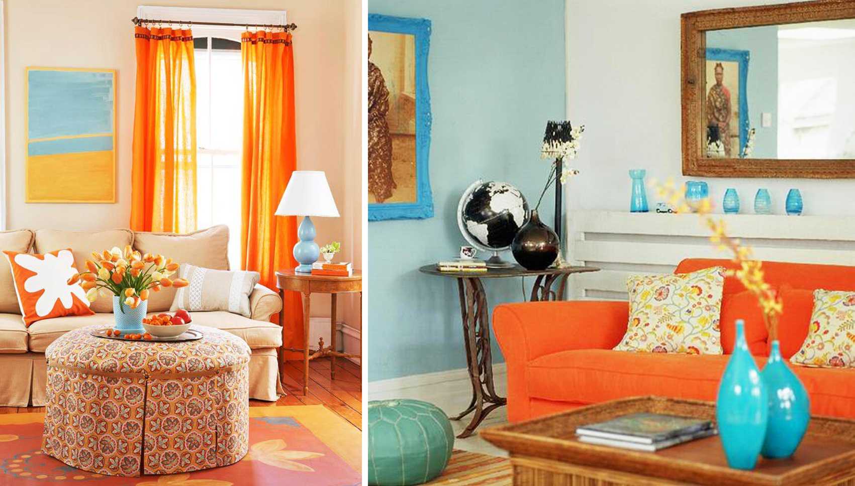
Modern apartment design in orange
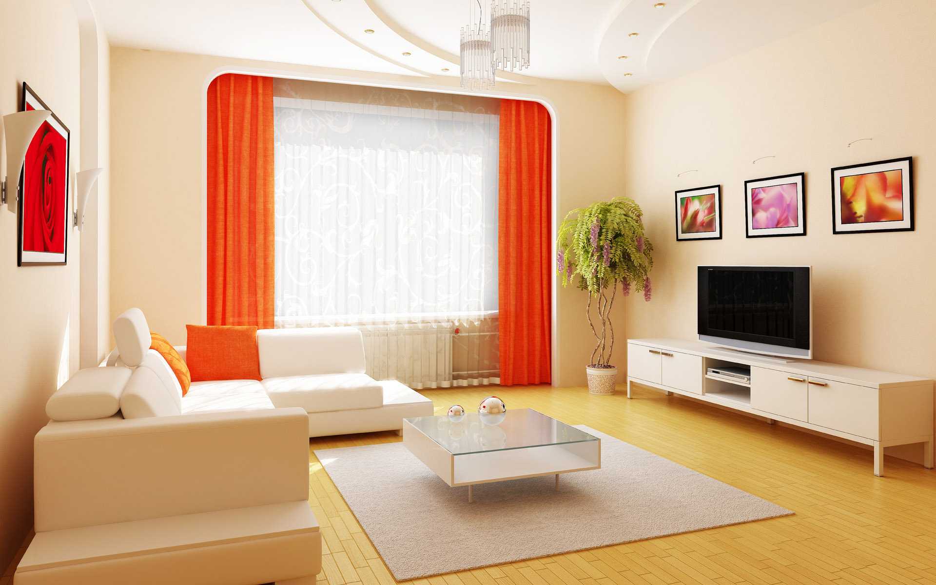
The combination of orange with other colors in the interior
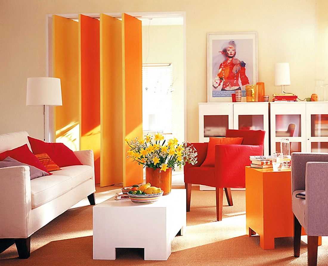
Room interior in orange
Red
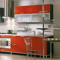
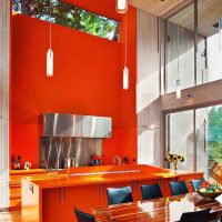
Since in the color spectrum these colors are directly next to each other, their combination is considered related and has a powerful effect.Thanks to the proximity of two warm tones, this union creates a bold cheerful mood, inspires a sense of strength, assertiveness, shades enhance and enrich each other. This can be a very cozy combination, if you combine a warm shade of orange with burgundy, or a hot fiery duet. A similar combination is found in eastern countries, since such a selection of color is associated with wealth. Combining such saturated colors, you need to ensure that they vary in saturation.
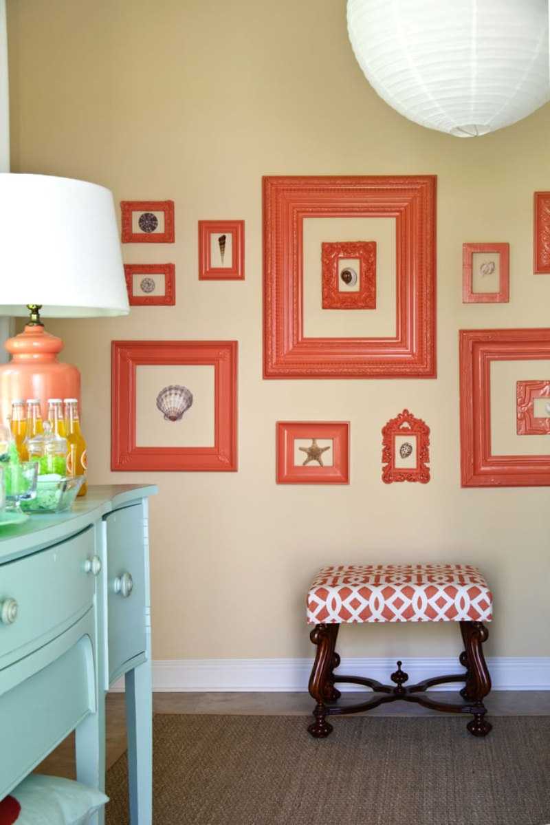
Orange color in the interior in combination with other shades
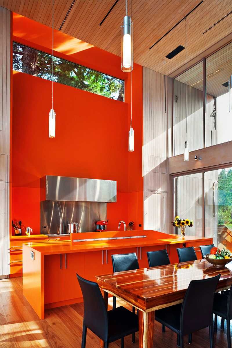
Apartment design in orange color in a combination of other shades
Yellow
Also a related combination. Unlike the union with red, this combination is characterized by a feeling of lightness, weightlessness. To maintain airiness and harmony in this combination, you need to do with a lighter, purer and warmer yellow tint. With a light yellow tone, the color becomes fresher, and with a “medium” it balances its brightness.
Brown
This is a very beautiful combination, warm and cozy, creating a harmonious combination. Dark, chocolate shades of brown, as well as caramel, light shades are good in combinations.
Green
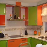
This is a rather risky and bold combination, not everyone will dare to resort to it. Nature seemed to suggest such a combination - the fruit of an orange surrounded by young foliage. This contrast looks fresh and bright, but it is worthwhile to carefully combine these tones with great care. It is better to use dark green, olive. The union of orange with cool green shades (malachite, mint emerald) looks great, so the main shade looks more expressive.
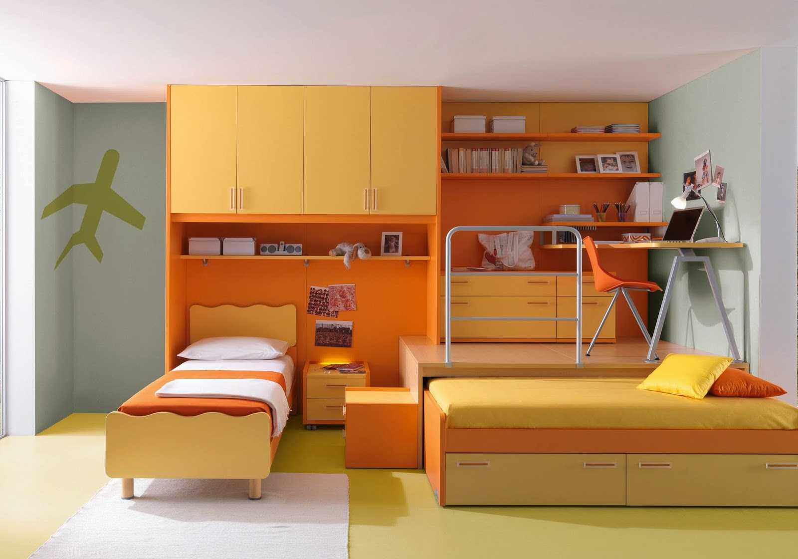
Modern apartment design in orange
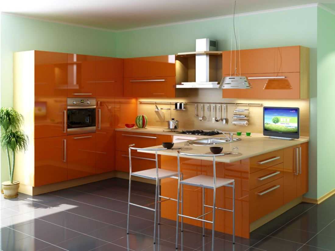
The combination of orange with other colors in the interior
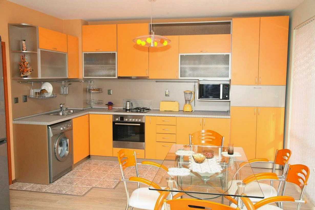
Room interior in orange
Blue
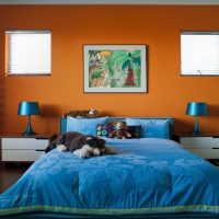
Extremely emotional combination. Due to the fact that these shades are complementary and are opposite each other in the color wheel, their combination is extremely expressive and built on the contrast of warm and cold, which helps to achieve very catchy and memorable images.
Blue
The combination of orange and blue is not suitable for everyone, this is a bold selection of the palette. It resembles the contrast of hot sand on the beach and the sky blue ocean. These shades make up the perfect summer duo that looks fresh and bold at the same time.
Pink
The combination with pink - this image will look interesting. However, it is worth considering that it is preferable to choose a bright shade, sometimes similar in saturation. The combination of the main tone with a shade of fuchsia, raspberry will look especially advantageous. Some light pink colors can also work.
Note. This is not all the shades with which you can combine a bright, intense and sunny color, which, according to psychologists, carries a feeling of openness, friendliness and cheerfulness. Even more combinations can be found with the so-called color wheel.
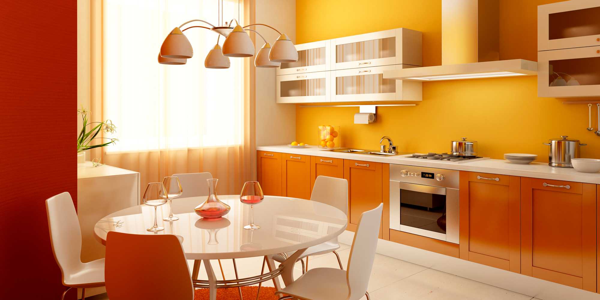
Orange color in the interior in combination with other shades

Apartment design in orange color in a combination of other shades
Symbols of orange color
Orange color is the sun, oranges, beach season, sand, summer heat and carefree. It is a symbol of warmth, joy and love of life, fire. You can warm yourself at a glance at this shade. Remembering the citrus trees, which each year bring a bountiful harvest, we can call the orange color of fertility, wealth. This tone is most popular in the East. In many Eastern religions, this shade means spiritual enlightenment by analogy with the rising sun. Therefore, Buddhist youths wear clothes of an orange-red hue. It symbolizes renunciation, patience and higher enlightenment.
On the contrary, in the countries of Europe this cheerful color can be met quite rarely, and it is only on warning signs or in overalls.And here this color has its positive associations. It is a shade of courage, honor, greatness and craving for adventure.
Video: Orange in the interior
