The combination of colors in the interior using the color wheel
The color scheme of the interior is the soul of the room. Indeed, in all styles, you can use any variety of colors, but not all of them "make friends" within the boundaries of any style. How to collect shades, put them together, come to the perfect solution?
Color combination (color wheel)
Content
Favorable combination
Attracting a variety of tones without analyzing their compatibility can give a lurid and tasteless look even to the most expensive repairs. From the first steps you can not do without understanding the basic principle of paints of any room: choose the main color, and then apply color complexes. At the same time, we will adopt Itten’s rule: only a combination of more than two colors can create a harmonious system. This will eliminate the common misconception when they rely on a combination of individual colors, losing sight of the whole picture. The second rule speaks of the importance of matching all elements to one style.
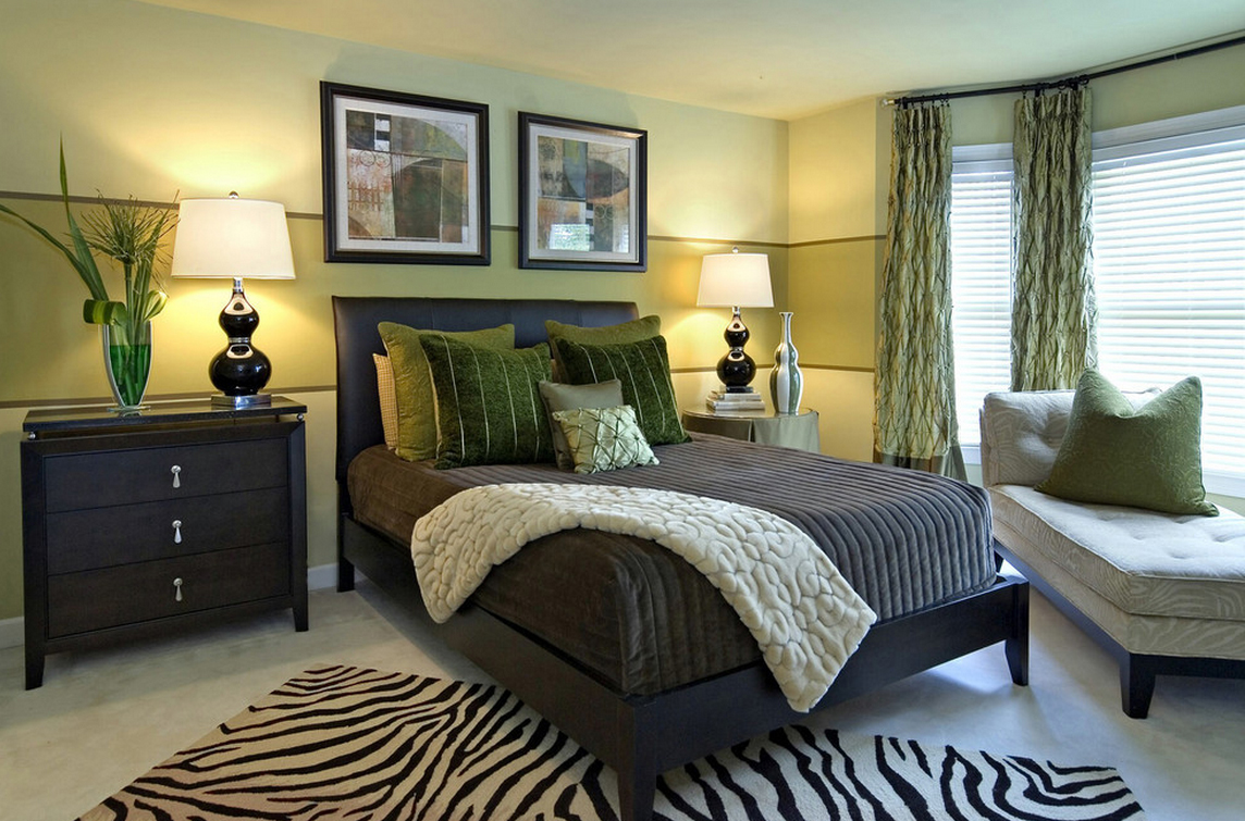
Bright bedroom
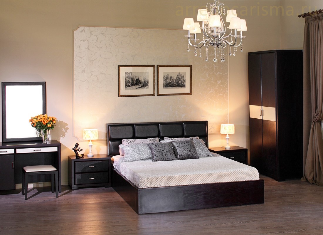
Chic bedroom
Kitchen
The traditional image is white and its tones. It is multifunctional, fits into the boundaries of all styles without any problems and behaves perfectly in a community of many colors. Snow-white cuisine idealizes cleanliness and orderliness. In addition, the calming tone of the room will have a beneficial effect on vision. In alliance with a small number of expressive little things, such a room is doomed to be festive. The best set is a white kitchen with red or brown elements.
Red feels comfortable in a large kitchen. Apparent stimulation of appetite can be added to its obvious advantages in the walls of such a room. But do not forget that effective paint can soon get bored. To get away from such difficulties, it is better to make pastel shades of red. If you list the colors that are friendly to red, it's white and black.
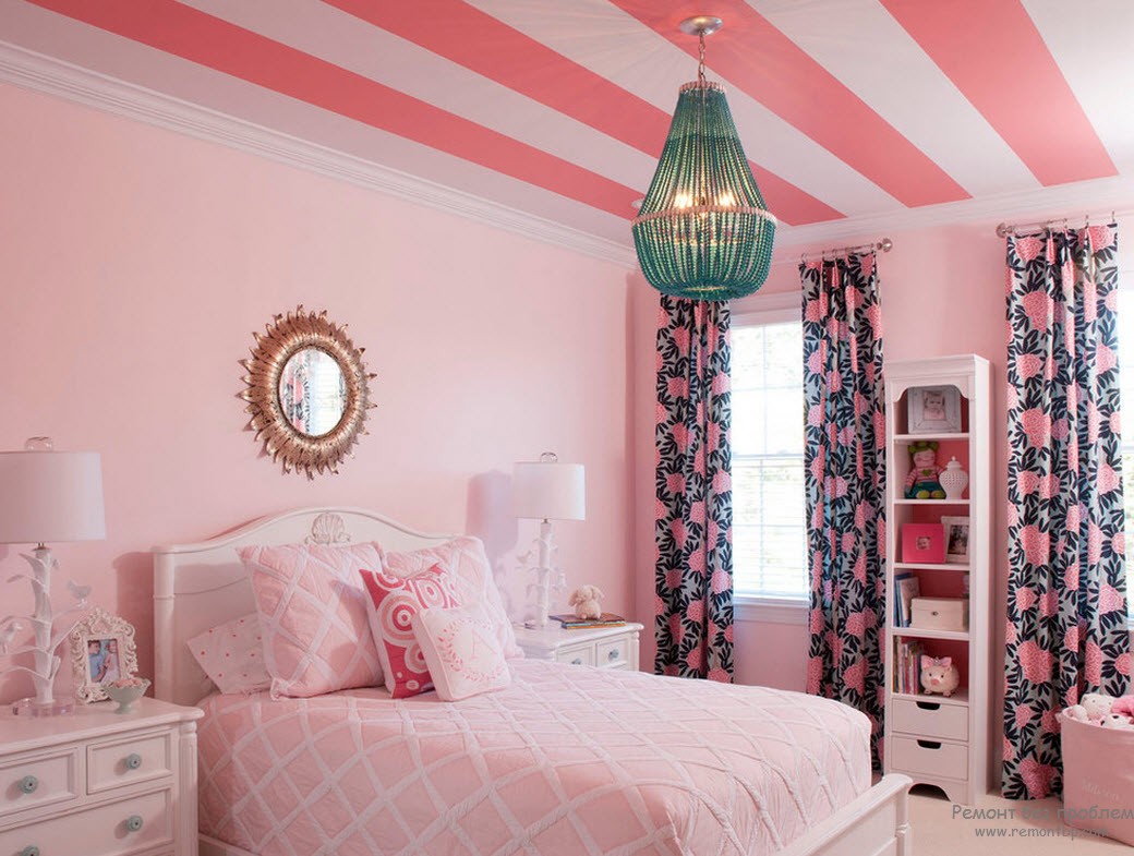
Bright pink bedroom design
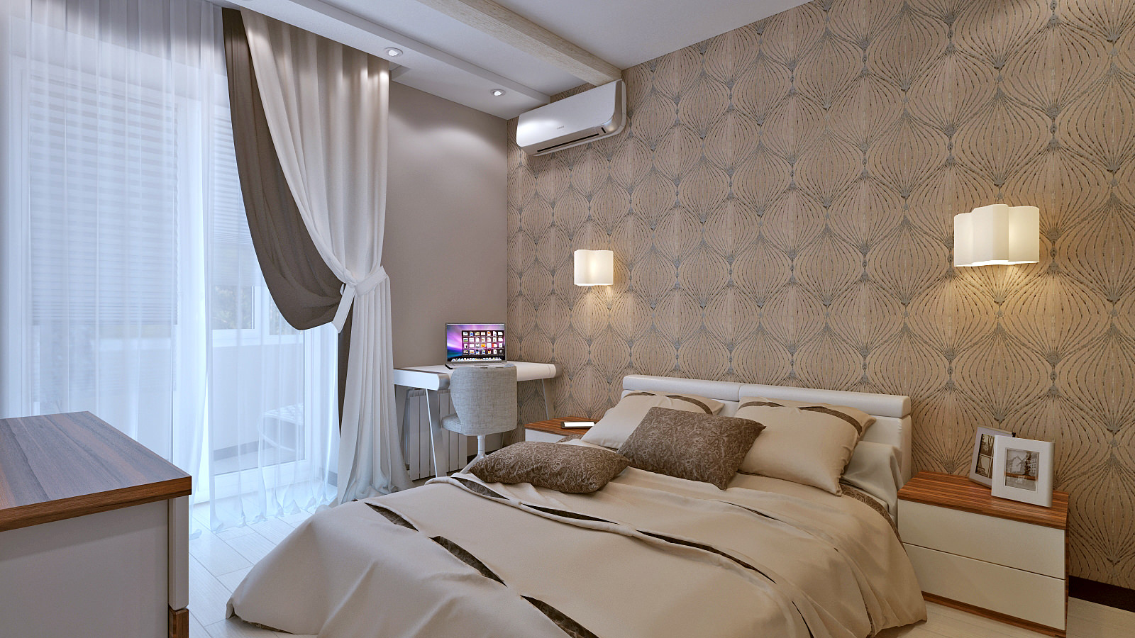
Bedroom interior
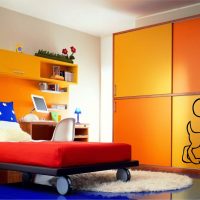
Orange - joyful, orange, radiant. A great solution if you want the kitchen to remain warm, clear and comfortable. Orange has many colors of "friendship": green, brown, white.
In blue, it is advantageous to decorate “hot” rooms. When the kitchen is turned to face more to the north, it is more profitable to move in favor of warm colors, otherwise the room will become “icy” even in hot temperatures. Blue favorably emphasize yellow, orange and white.
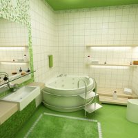
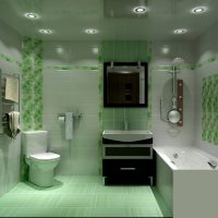
Green is an impression of a summer meadow, a sunny forest. Regarding the choice of the main tone for the kitchen - he is king. Its delicate shades pacify the heart and stimulate appetite. Green in the kitchen sounds magical in the company of cloud and sky.

Large bright room
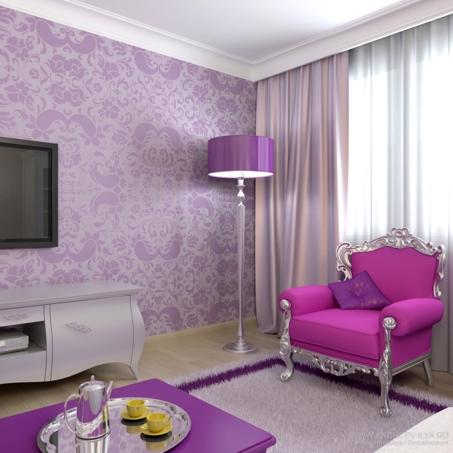
Purple room
Yellow as the main color is good when the light is carefully tuned. Otherwise, the room will turn into a dreary depressive place. The best “pairs” for yellow in the kitchen are white, blue, gray.
Violet in the soloists of the kitchen is a very daring move. This original always takes space out of the ordinary. Violet can add freshness and style to the kitchen. This color is capricious, but friendly with olive notes or shades of ocher.
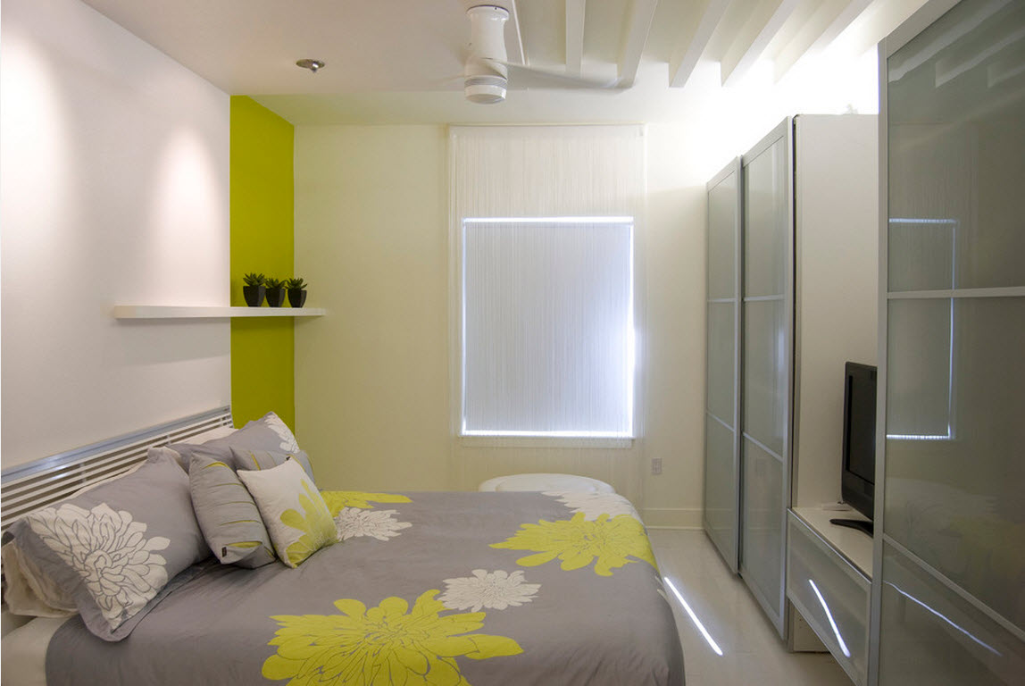
Bright bedroom
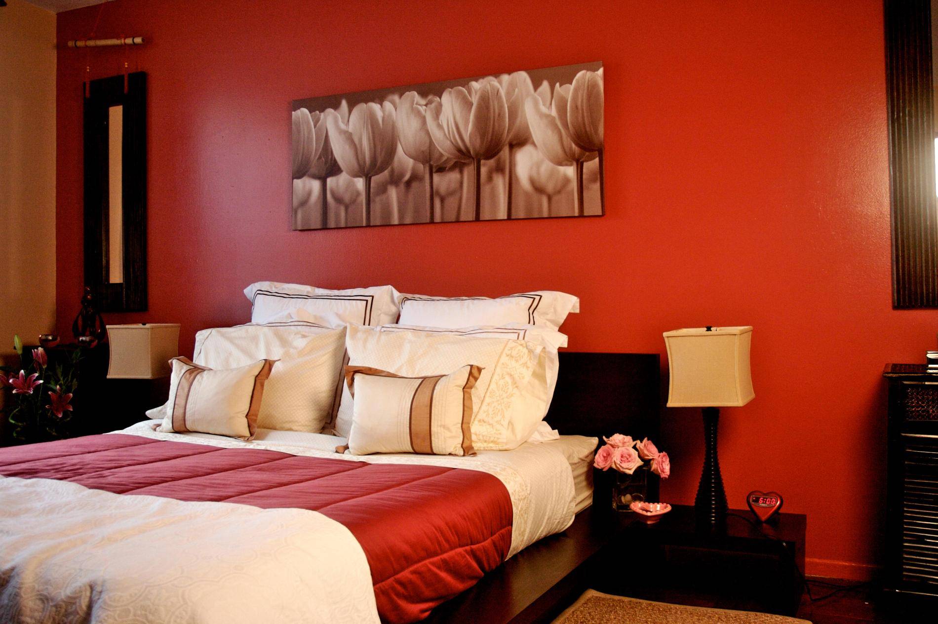
Red bedroom
Bedroom
When choosing color variations for a bedroom, it is important to understand that this is a zone of rest, relaxation and sleep.For most modern workers, the bedroom is the only refuge from the daily bustle. Do not forget about this when choosing a room color palette.
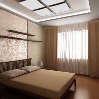
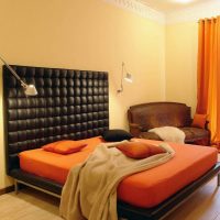
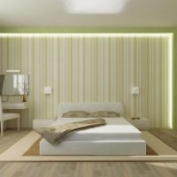
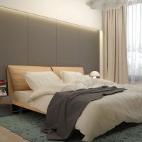
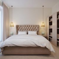
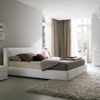
- Of all the colors, a bedroom gets along well with beige. It provides an opportunity to relax the eyes, amuses the heart, relaxes well. In the role of the main tone, he is very comfortable, because he will create a pair of all the variety of colors. The best kits: white, black, brown and green.
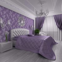
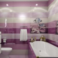
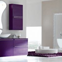
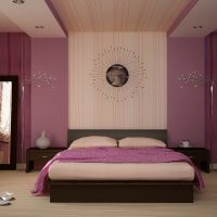
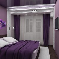
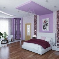
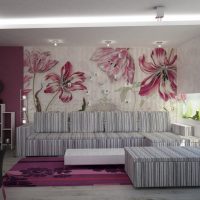
- Sleeping in purple is a predominantly feminine solution. The freest and most daring of flowers. So that the bedroom does not look dull, white and brown in light colors are better combined with purple.
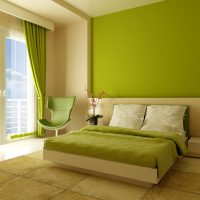
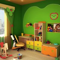
- The green bedroom is a sign of optimism and cheerfulness of its owner. Perfectly play along with early awakening. Freshness and brightness will inspire an easy start to the day and add thoughtfulness and energy to thoughts. In a bright design, you can attach white, yellow, light brown. Saturated green will be favorably served with brown, blue, dense beige.
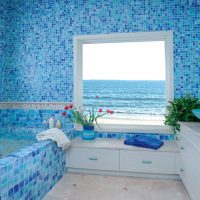
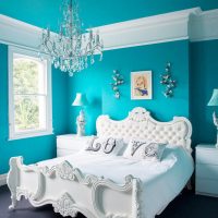
- The bedroom in blue is the choice of romantics dreaming of a warm ocean or heaven. Blue at the main post in the bedroom creates an atmosphere of relaxation, drives away a gloomy mood, relieves stress. The blue color in the bedroom wins with white, red and brown.
- Brown for the bedroom represents a traditional approach. It perfectly matches green, beige, black.
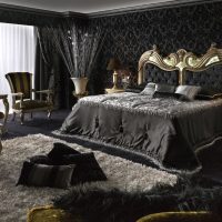
- Black for the bedroom is an unusual solution. If you are not afraid that black will psychologically crush - act. White and shades of brown can reduce its negative effect in the bedroom.
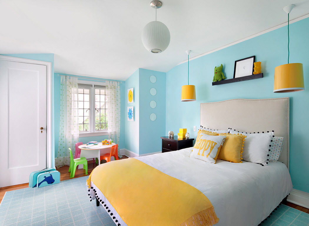
Bright blue bedroom
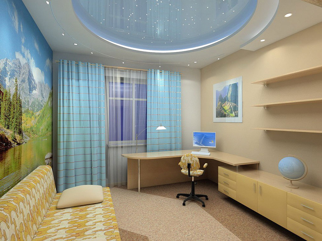
Bright room interior
Living room
We can say that the living room is a business card at home. The space of such a room solves several problems at once:
- guest and holiday;
- office for evening gatherings;
- cozy home theater.
The colors of this room are important. And the living room is especially demanding on the selection of the palette.
- Living room in beige is the perfect solution. Design from contrasting colors will be unsuccessful, it is more profitable to choose close tones. Beige looks great with brown details.
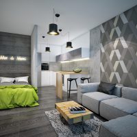
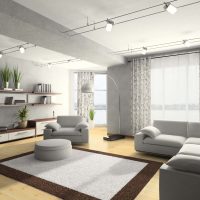
- Gray, as a leader in the interior design of the living room, is not a very common option. The main thing when working with it is halftone. Clear shades will give a mood of elegance, but the darkened gray will easily turn into a hymn of boredom and gloom. Gray of all colors is stronger friends with orange.
- Green rich tones will not leave anyone indifferent. The best pairs for him are brown, white, yellow.
- Lilac is festive and airy. Perfectly correlated with this color is beige, brown.
- Purple in the living room will look noble. Dark shades will add space to the holiday, and clear shades will add magic. In the living room it sounds nice with red, pink, orange.
- If the search for the leading colors of the living room is stopped by red - do not forget about caution. It easily starts to “crush” and annoy. Combining red is better with such: brown, beige, gold, black.
- The blue living room is decorated with traditionally phlegmatic natures. In a muffled performance, he can set the theme of the room indefinitely, because it is simple and tactful. Successfully blue looks with red, beige.
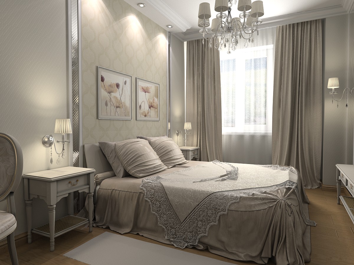
Beautiful bright bedroom
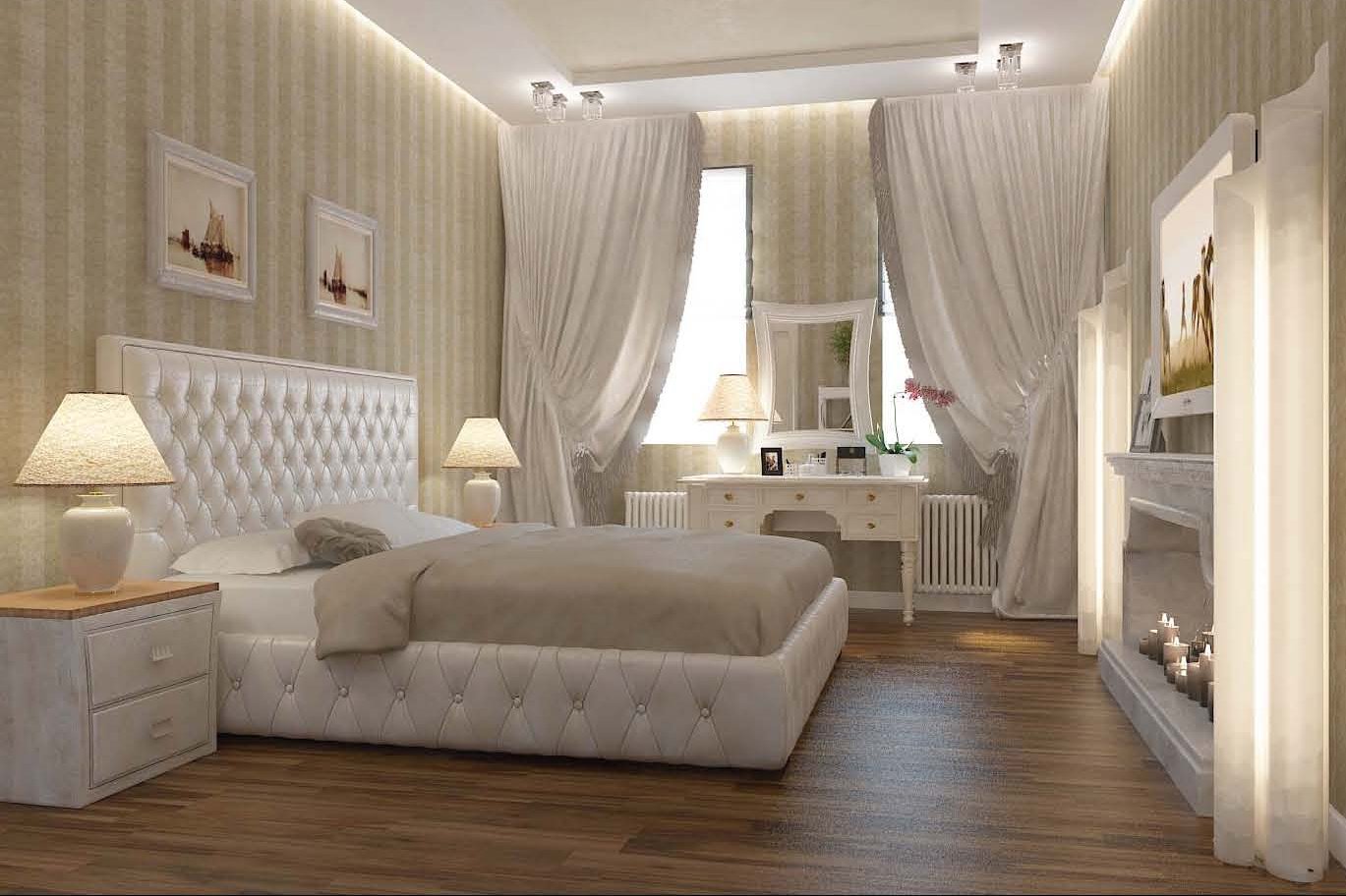
Bright white bedroom
Wheel of flowers
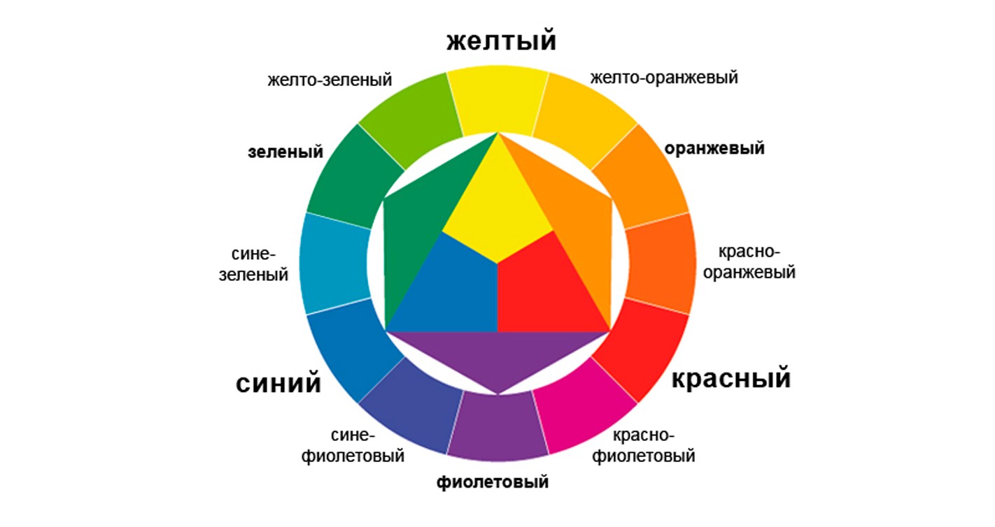
In nature, there are no incompatible colors. It is easiest to analyze color systems using the Itten circle method, which is commonly used for color organization. At its base there is a triangle of colors: blue, yellow and red - from the dilution of which the entire spectrum is created. For example, blue and yellow in equal parts creates green, yellow and red - orange, red and blue - purple. Twelve colors of the interior are enough for us.
All shades have an antagonist. Yellow is purple, blue is orange, red is green. The ensembles of such interior colors are very interesting, although they must be used with care. It is better to combine without impurities without introducing gray.Especially sophisticated decor is achieved if used in fabrics.
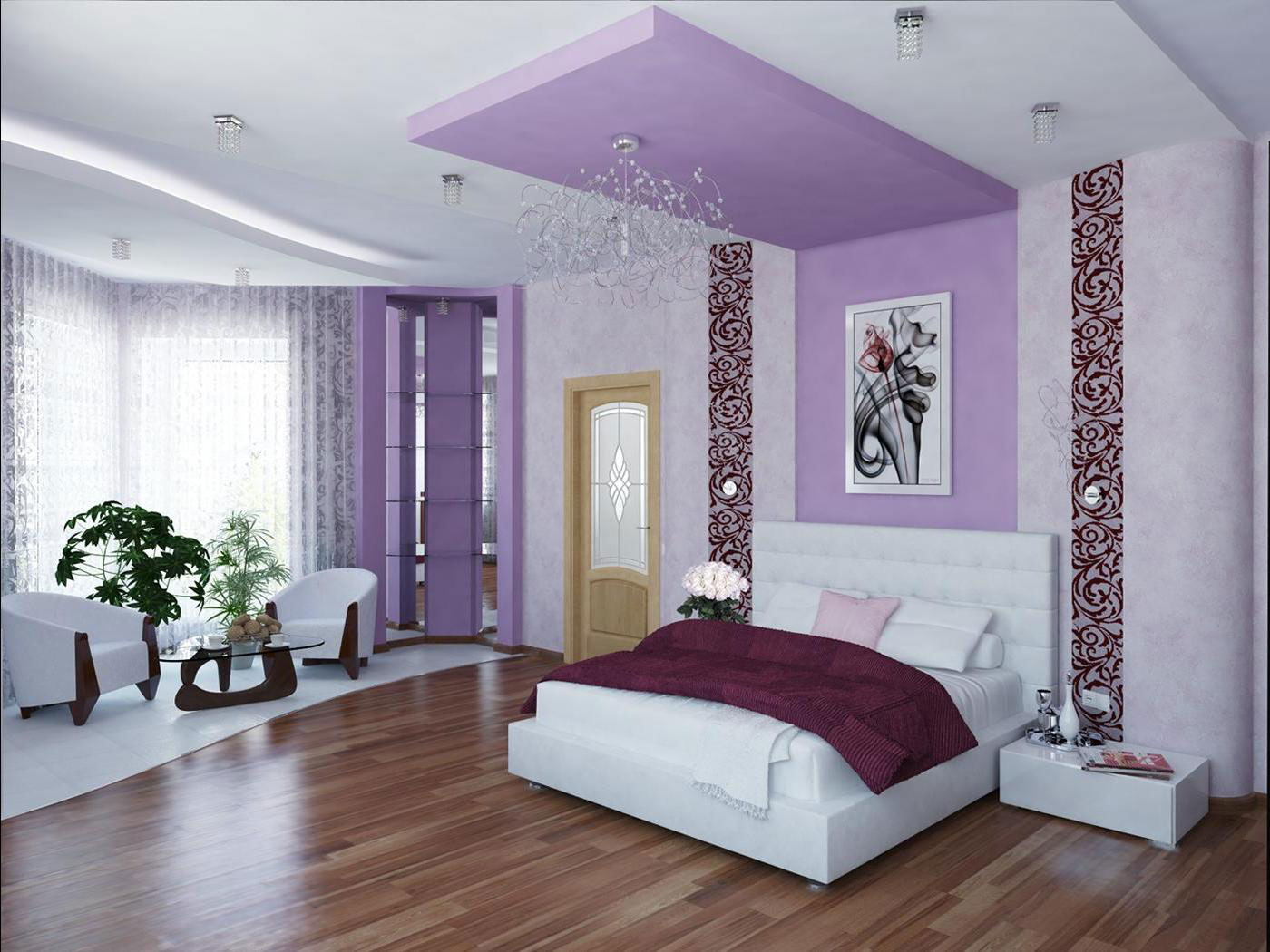
Bright bedroom
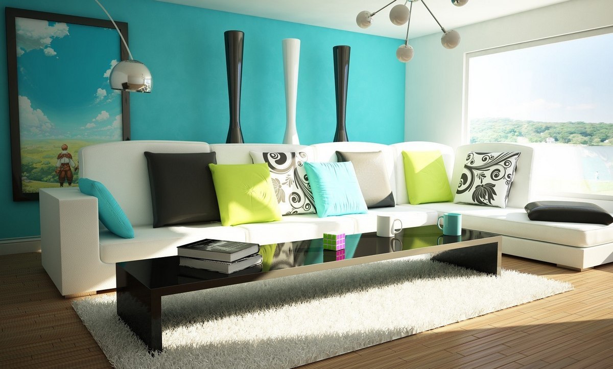
Room in blue tones
The circle allows you to divide the gamut of colors into cold and warm. As you can see, the effect of colors in additional pairs is mutually reciprocal. To give the interior warmth or coolness, you need to increase part of the shades with the appropriate properties. The peculiarity of green is that it can not be called either warm or cold, this is due to the combination of what colors of the interior surrounds. Its antipode is red, the most powerful in energy. Against the background of green, it visually moves to the forefront, and its influence on the viewer increases. Such a very picturesque couple can resurrect the most dreary interior, if the ratio is correctly observed in order to avoid excessive brightness and irritation.
Decor from complementary interior colors can be annoying if they use the deepest shades. There is a technique that somewhat softens their duet without destroying reciprocity. To do this, not a diametral, but his colleague is put to the leader from the circle of flowers. Such pairs are considered as far removed.

Bright bedroom

Bedroom in red
Related harmonious “unions”
In the decors, the contrasting combination of shades of the interior is considered the most catchy and colorful. In addition to them, there are related unions where you can guess a more winning combination.
Related shades are located on neighboring sectors of the circle: yellow and lemon, purple and pink, green and blue. Usually, duets are enough for interior design, but the trios give more freedom in achieving the ideal.
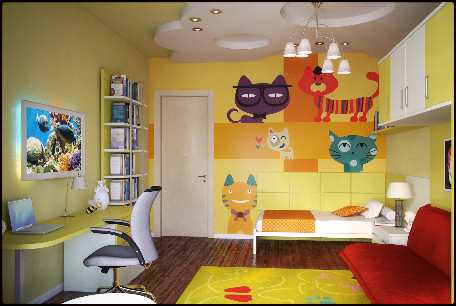
Bright kids room
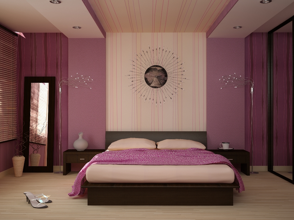
Bright bedroom
Crib "friendly colors"
The right combination of colors in interior design is the foundation of the perfect decor. With this cheat sheet you will never be mistaken at registration of anything.
- Complementary pairs. The combination of the opposite colors of the circle.
- Triads. A combination of three colors spaced at equal intervals of colors.
- Squares. Four tones equidistant from each other.
- Similar. Groups of 2 to 3 adjacent colors.
- Separately complementary. Compounds of colors close to the opposite.

Large bright bedroom design

Bedroom in warm colors
Lighting
For the correct presentation of the gamut of colors, it is necessary to take into account the arrangement of lighting:
- there should not be sudden transitions from shadow to light, strong shine - all this harms the eyes and tires the psyche;
- let the strong and weak zones of light correspond to the tonality of colors;
- Lighting should match the type of room.

Sleeping in warm colors

Living room interior
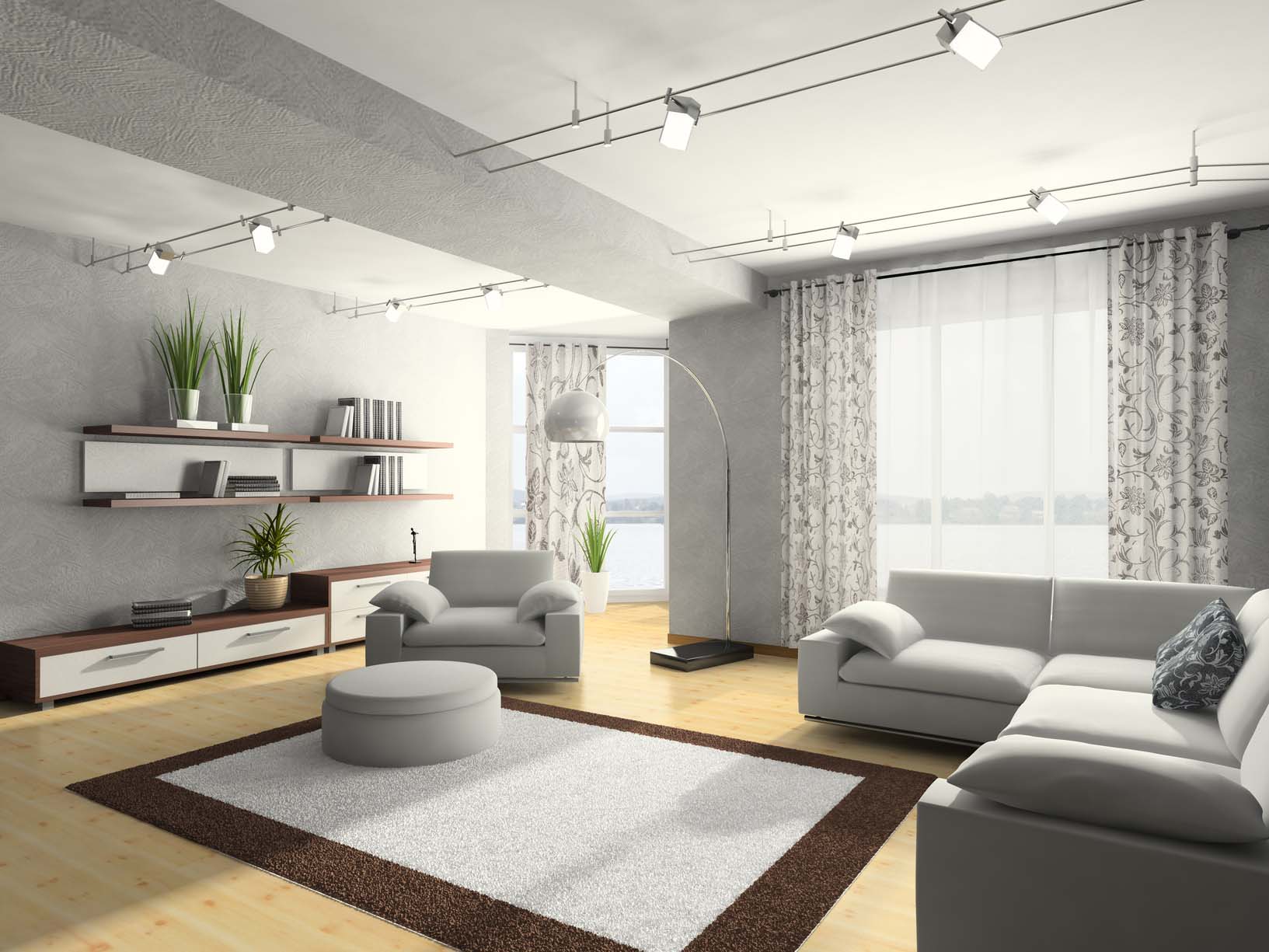
Light room
The space is three-dimensional, and the construction of floor lighting will highlight the depth of the spectrum. It is known that light contains all the colors, and the ability to correctly position reflective surfaces will help to make the magic of turning light into a colorful fairy tale.
Video: Designer Tips. The perfect color scheme for the kitchen
